| View previous topic :: View next topic |
| Author |
Message |
Ysoft_Entertainment
VB Programmer
Joined: 23 Sep 2003
Posts: 810
Location: Wherever There is a good game.
|
 Posted: Wed Oct 29, 2003 9:02 am Post subject: what do you think of this? Posted: Wed Oct 29, 2003 9:02 am Post subject: what do you think of this? |
 |
|
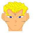
ok check the avatar and tell me if it is a good or bad walkabout for a hero of my hopefully upcomming game?
_________________
Try my OHR exporter/importer.
OHRGFX
Striving to become better pixel artist then Fenrir Lunaris. Unfortunately the laziness gets in the way of my goals. |
|
| Back to top |
|
 |
Sephyroth
Renegade Rebel Redmage
Class A Minstrel

Joined: 04 Feb 2003
Posts: 644
Location: Schmocation
|
| Posted: Wed Oct 29, 2003 9:05 am Post subject: |
|
|
I'm not an expert on this but...
The form looks pretty good, but it looks like you haven't tried to use any shading... Maybe that'd help a bit.
_________________
im realy ded  |
|
| Back to top |
|
|
Iblis
Ghost Cat

Joined: 26 May 2003
Posts: 1233
Location: Your brain
|
| Posted: Wed Oct 29, 2003 9:34 am Post subject: |
|
|
That looks quite good, as it is. Some more shading would probably make it better though.
_________________
Locked
OHR Piano |
|
| Back to top |
|
|
madhatter
Best procrastinator in all of North America

Joined: 30 Sep 2003
Posts: 322
Location: A boonie town, Ontario, Canada.
|
| Posted: Wed Oct 29, 2003 12:38 pm Post subject: |
|
|
| Use less black, though, and perhaps use a different colour scheme. Otherwise, 'tis good. |
|
| Back to top |
|
|
Shadowiii
It's been real.

Joined: 14 Feb 2003
Posts: 2460
|
| Posted: Wed Oct 29, 2003 12:57 pm Post subject: |
|
|
I disagree, the black level is well done.
More detail on the hair. Also, we can't really determine whether this is "good" or "bad" because 60%+ depends on the animation itself.
Looks really good, though. Keep it up.
_________________
But enough talk, have at you! |
|
| Back to top |
|
|
madhatter
Best procrastinator in all of North America
Joined: 30 Sep 2003
Posts: 322
Location: A boonie town, Ontario, Canada.
|
| Posted: Wed Oct 29, 2003 1:11 pm Post subject: |
|
|
| The hair seems a bit flat at the top, like his head has stretched horizontally a bit. |
|
| Back to top |
|
|
Ysoft_Entertainment
VB Programmer
Joined: 23 Sep 2003
Posts: 810
Location: Wherever There is a good game.
|
| Posted: Wed Oct 29, 2003 7:26 pm Post subject: |
|
|
I will try to work out the hair, since it is the thing in question
_________________
Try my OHR exporter/importer.
OHRGFX
Striving to become better pixel artist then Fenrir Lunaris. Unfortunately the laziness gets in the way of my goals. |
|
| Back to top |
|
|
LeRoy_Leo
Project manager
Class S Minstrel
Joined: 24 Sep 2003
Posts: 2683
Location: The dead-center of your brain!
|
| Posted: Wed Oct 29, 2003 8:57 pm Post subject: |
|
|
Looks like youve got a good understanding of pixelation, so there is really nothing I can say to help much. Keep it up, and youll be one of the greatest! 
*groans* I wanna be one of the greatest too... ...
_________________
Planning Project Blood Summons, an MMORPG which will incinerate all of the others with it's sheer brilliance...
---msw188 ---
"Seriously James, you keep rolling out the awesome like gingerbread men on a horror-movie assembly line. " |
|
| Back to top |
|
|
Lucier
that one girl
Joined: 06 Aug 2003
Posts: 139
Location: dallas, tx
|
| Posted: Thu Oct 30, 2003 5:13 am Post subject: |
|
|
I don't know about his limbs... They almost look like they're not connected to his body, in a way. Maybe try adding a pixel to each shoulder, and a pixel to both sides of his hips. I don't care much for the color scheme either, but that's not really a technical suggestion.
_________________
insert myspace link here. |
|
| Back to top |
|
|
Flamer
The last guy on earth...
Joined: 04 Feb 2003
Posts: 725
Location: New Zealand (newly discovered)
|
| Posted: Thu Oct 30, 2003 7:33 am Post subject: |
|
|
nice pic
kinda agree with lucier on the "not connected" bit, his head looks like it has no relation with the body. maybe add a pixel under each cheek. i dunno... still pretty good.
_________________
If we were a pack of dogs, IM would be a grand Hound, CN would be a very ficious little pitball, and Giz...well, it doesn't matter breed he is, he'd still be a bitch 
(no offense to anyone that was mentioned) |
|
| Back to top |
|
|
LeRoy_Leo
Project manager
Class S Minstrel
Joined: 24 Sep 2003
Posts: 2683
Location: The dead-center of your brain!
|
| Posted: Thu Oct 30, 2003 2:30 pm Post subject: |
|
|
Limbs are hard to make. Thats why its good not to start with Humanoids, and work your way up. Personally, that bugs me... 
(Doesnt anyone ever agree wit me?)
_________________
Planning Project Blood Summons, an MMORPG which will incinerate all of the others with it's sheer brilliance...
---msw188 ---
"Seriously James, you keep rolling out the awesome like gingerbread men on a horror-movie assembly line. " |
|
| Back to top |
|
|
Sephyroth
Renegade Rebel Redmage
Class A Minstrel
Joined: 04 Feb 2003
Posts: 644
Location: Schmocation
|
| Posted: Thu Oct 30, 2003 2:41 pm Post subject: |
|
|
I don't think it really makes a different how you go about developing your walkabout skills. Once you develop your own distinct style (for drawing anything), everything else just kind of fits in.
_________________
im realy ded
Last edited by Sephyroth on Thu Oct 30, 2003 4:13 pm; edited 1 time in total |
|
| Back to top |
|
|
Minnek
Conjurer

Joined: 03 Jun 2003
Posts: 430
Location: Somewhere
|
| Posted: Thu Oct 30, 2003 2:45 pm Post subject: |
|
|
I'm having trouble with my style, the pallettes just don't seem big enough. I'll probably have to do something about that... not sure what, though. I guess I can always just make their shoes black, which would save me a whole color spot in the pallette.
_________________
* SDHawk has joined #Minnek
SDHawk> AAAAAAAAAAAAAUUUUUUUUUGH
* SDHawk has left #Minnek (Leaving) |
|
| Back to top |
|
|
madhatter
Best procrastinator in all of North America
Joined: 30 Sep 2003
Posts: 322
Location: A boonie town, Ontario, Canada.
|
| Posted: Thu Oct 30, 2003 2:50 pm Post subject: |
|
|
Minnek, just make the colour of the shoes the same as the hair. It balances it out, and if the colours fit nicely enough, it'll look good. You should use three main colours, two shades of each colour. One for the hair, one for the torso, and one for the lower body. Then there's black, white, 2 skin shades, cyan as the transparent colour, and then colours for details.
My avatar over there is divided like this:
dark & light purple for hair and skirt (2)
dark & light yellow for tanktop and shoes (2)
white for eyes and black for outlining (2)
light & dark skin tone (2)
dark & light pink for cape (2)
cyan for transparency (1)
four colours are left over for miscellaneous things which I haven't added yet |
|
| Back to top |
|
|
Sephyroth
Renegade Rebel Redmage
Class A Minstrel
Joined: 04 Feb 2003
Posts: 644
Location: Schmocation
|
| Posted: Thu Oct 30, 2003 2:59 pm Post subject: |
|
|
For a palette... I usually have one white, 3 shades of skin tone, 4 shades for the hair, and 4 shades for the clothes. The remaining colors are mystery meat.
_________________
im realy ded |
|
| Back to top |
|
|
|

