 |
Castle Paradox
|
| View previous topic :: View next topic |
| Author |
Message |
Pumpkinbot
Rock beats scissors! >:D
Joined: 22 Apr 2009
Posts: 106
Location: Megaman, Cutman's level.
|
 Posted: Wed Apr 29, 2009 7:23 pm Post subject: Newbie needs helpful hints! X) (New ones up!) Posted: Wed Apr 29, 2009 7:23 pm Post subject: Newbie needs helpful hints! X) (New ones up!) |
 |
|
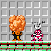
I'm making a game called Exo, and I'm starting on the hero graphics. I've done some pixel art, like my avatar (an edited Megaman sprite) but nothing like this from scratch. Here is Oliver, the starting character.

Now, I know I'm not very good, but I know I can get better. I just need tips on how I can make this better. 
Last edited by Pumpkinbot on Tue May 05, 2009 4:28 pm; edited 1 time in total |
|
| Back to top |
|
 |
Moogle1
Scourge of the Seas
Halloween 2006 Creativity Winner


Joined: 15 Jul 2004
Posts: 3377
Location: Seattle, WA
|
| Posted: Wed Apr 29, 2009 7:59 pm Post subject: |
|
|
Reduce the number of shades you're using. You're overshading and it doesn't show up very well. Instead, focus on form. He has no shoulders and a peg leg. Also, the design is boring. Reducing the number of shades of everything will open up palette slots for new colors, which this guy really needs.
This isn't bad for a first attempt, but you're making lots of classical errors. Keep at it.
(edit) also, editing mega man sprites is a poor substitute for practicing your own ;)
_________________
|
|
| Back to top |
|
|
Spoon Weaver
Joined: 18 Nov 2008
Posts: 421
Location: @home
|
| Posted: Wed Apr 29, 2009 8:43 pm Post subject: |
|
|
I think it's great.
My advise for making him better would be to fatten him up. No one likes a skinny kid ( also thicker characters pixelate better, the peg leg Mog mentioned would be a symptom of this ) Also He needs more of a face, and perhaps less yellow skin, unless its some sort of story plot that the people in your world are faceless yellow people. If so never mind.
Lastly, what mog said about the shading, it basically confuses me when I look at his jacket. The over shading and randomization of shading leads one to think that theres objects there that aren't. ( like perhaps 3 or four pockets on the jacket? seriously is there suppose to be pockets? ) |
|
| Back to top |
|
|
TwinHamster
♫ Furious souls, burn eternally! ♫
Joined: 07 Mar 2004
Posts: 1352
|
| Posted: Thu Apr 30, 2009 4:10 am Post subject: |
|
|
I think your form and color-numbers are fine.
However, you should make a bit more use of contrast to make the similar colors more identifiable.

That extra left shoulder was a little strange.
| Moogle1 wrote: | | mega man sprites |
Really? |
|
| Back to top |
|
|
Moogle1
Scourge of the Seas
Halloween 2006 Creativity Winner
Joined: 15 Jul 2004
Posts: 3377
Location: Seattle, WA
|
| Posted: Thu Apr 30, 2009 8:38 am Post subject: Re: Newbie needs helpful hints! X) |
|
|
| Pumpkinbot wrote: | | I've done some pixel art, like my avatar (an edited Megaman sprite) |
Really.
_________________
|
|
| Back to top |
|
|
Pumpkinbot
Rock beats scissors! >:D
Joined: 22 Apr 2009
Posts: 106
Location: Megaman, Cutman's level.
|
| Posted: Thu Apr 30, 2009 3:01 pm Post subject: Re: Newbie needs helpful hints! X) |
|
|
X) Thanks, guys. I'll edit him a little bit.
| TwinHamster wrote: |
That extra left shoulder was a little strange.
|
It was supposed to be a hood for his sweatshirt. ._.
| Spoon Weaver wrote: | | Also He needs more of a face, and perhaps less yellow skin, unless its some sort of story plot that the people in your world are faceless yellow people. If so never mind. |
Yes, he's from a Simpson's episode. X) No, I'm kidding. I'll tone it down a bit.
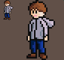
EDIT: How's this?

Oh, and any suggestions for his hood?
EDIT2: Oh, wow. After juxtapositioning the two versions, this one does look better! I remember one of my problems I had with him was he didn't look like he was confident. Now that I "fattened him up," as Spoon Weaver put it, he does look like he's confident. Also, I changed the colors a bit.
Last edited by Pumpkinbot on Thu Apr 30, 2009 5:56 pm; edited 2 times in total |
|
| Back to top |
|
|
Newbie_Power

Joined: 04 Sep 2006
Posts: 1762
|
| Posted: Thu Apr 30, 2009 5:45 pm Post subject: |
|
|
Cut down on the dithering. Dithering doesn't work very well for small sprites (in fact, I'm learning from recent mistakes that dithering doesn't work for a lot of things.  ) )
When shading based on light source, keep in mind that the same shade will cast over flatter surfaces such as the shirt or face. Think of a shading of a cube in 3D, where you don't see a gradation on the side, just another flat shade. The darker shade won't come until after it starts curving towards the other side (which would be around the edge towards the arm).
_________________

TheGiz> Am I the only one who likes to imagine that Elijah Wood's character in Back to the Future 2, the kid at the Wild Gunman machine in the Cafe 80's, is some future descendant of the AVGN? |
|
| Back to top |
|
|
Pumpkinbot
Rock beats scissors! >:D
Joined: 22 Apr 2009
Posts: 106
Location: Megaman, Cutman's level.
|
| Posted: Thu Apr 30, 2009 5:57 pm Post subject: |
|
|
| Newbie_Power wrote: | Cut down on the dithering. Dithering doesn't work very well for small sprites (in fact, I'm learning from recent mistakes that dithering doesn't work for a lot of things. )
When shading based on light source, keep in mind that the same shade will cast over flatter surfaces such as the shirt or face. Think of a shading of a cube in 3D, where you don't see a gradation on the side, just another flat shade. The darker shade won't come until after it starts curving towards the other side (which would be around the edge towards the arm). |
True.  I'll do that. I'll do that.
EDIT: Oh, wow, that does look better. :o

But he still needs his hood! Mario has his red hat, Sonic has his shoes, Oliver has his hoodie. Without a hood, it's just a sweatshirt.  |
|
| Back to top |
|
|
Spoon Weaver
Joined: 18 Nov 2008
Posts: 421
Location: @home
|
| Posted: Thu Apr 30, 2009 6:24 pm Post subject: |
|
|
| I suggest changing the color of the horizontal crease lines to a color other then the outline lines of the jacket. |
|
| Back to top |
|
|
Newbie_Power
Joined: 04 Sep 2006
Posts: 1762
|
| Posted: Thu Apr 30, 2009 6:35 pm Post subject: |
|
|
| Quote: | | EDIT: Oh, wow, that does look better. :o |
You didn't fix how the left (our left) side of the shirt shouldn't be darker since it's really just the same plane as the right side, just with a line down the middle.
_________________
TheGiz> Am I the only one who likes to imagine that Elijah Wood's character in Back to the Future 2, the kid at the Wild Gunman machine in the Cafe 80's, is some future descendant of the AVGN? |
|
| Back to top |
|
|
Pumpkinbot
Rock beats scissors! >:D
Joined: 22 Apr 2009
Posts: 106
Location: Megaman, Cutman's level.
|
| Posted: Thu Apr 30, 2009 6:41 pm Post subject: |
|
|
| Newbie_Power wrote: | | Quote: | | EDIT: Oh, wow, that does look better. :o |
You didn't fix how the left (our left) side of the shirt shouldn't be darker since it's really just the same plane as the right side, just with a line down the middle. |
He's turned slightly to the right, though. I don't see why his right arm, shaded from the sun (the left side) should be the same shade as his body, which is partially shaded by his left arm, but not totally.
EDIT: Oh, I see what you mean. X) The left (our left) side of the shirt. I'll fix it.
Last edited by Pumpkinbot on Thu Apr 30, 2009 6:47 pm; edited 4 times in total |
|
| Back to top |
|
|
Newbie_Power
Joined: 04 Sep 2006
Posts: 1762
|
| Posted: Thu Apr 30, 2009 6:42 pm Post subject: |
|
|
I'm not talking about the arms. I'm talking about the torso area.
Only (our) left edge of the torso would be darker as it curves towards the farther side (and even then, don't overdo such curve as it's very small), not the whole side of the shirt that's divided by the line in the middle.
_________________
TheGiz> Am I the only one who likes to imagine that Elijah Wood's character in Back to the Future 2, the kid at the Wild Gunman machine in the Cafe 80's, is some future descendant of the AVGN? |
|
| Back to top |
|
|
Pumpkinbot
Rock beats scissors! >:D
Joined: 22 Apr 2009
Posts: 106
Location: Megaman, Cutman's level.
|
| Posted: Thu Apr 30, 2009 6:44 pm Post subject: |
|
|
| Newbie_Power wrote: | I'm not talking about the arms. I'm talking about the torso area.
Only (our) left edge of the torso would be darker as it curves towards the farther side (and even then, don't overdo such curve as it's very small), not the whole side of the shirt that's divided by the line in the middle. |
*points to edit* Late edit, eh? X)
| Spoon Weaver wrote: |
I suggest changing the color of the horizontal crease lines to a color other then the outline lines of the jacket. |
Well, I don't have enough colors as it is. I have the background color, the outline color, 3 shades for the skin, 3 shades for the skin (and another to separate the skin from the hair), 3 for the pants, and 4 for the jacket. I don't have the space for a fifth shade, and the black is too much darker to act as that fifth shade.
...Does that make sense? |
|
| Back to top |
|
|
Spoon Weaver
Joined: 18 Nov 2008
Posts: 421
Location: @home
|
| Posted: Thu Apr 30, 2009 7:06 pm Post subject: |
|
|
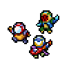
I suggest something like this.
though the color count and palette might be off. |
|
| Back to top |
|
|
TwinHamster
♫ Furious souls, burn eternally! ♫
Joined: 07 Mar 2004
Posts: 1352
|
| Posted: Thu Apr 30, 2009 7:07 pm Post subject: |
|
|
| Quote: | | Well, I don't have enough colors as it is. I have the background color, the outline color, 3 shades for the skin, 3 shades for the skin (and another to separate the skin from the hair), 3 for the pants, and 4 for the jacket. I don't have the space for a fifth shade, and the black is too much darker to act as that fifth shade. |
In actuality, you could probably get away with using fewer colors.

Not that you have to use them, but with 2 blues, 2 browns, 5 grays, and a background, you have 6 colors left.
Last edited by TwinHamster on Thu Apr 30, 2009 7:10 pm; edited 1 time in total |
|
| Back to top |
|
|
|
|
You cannot post new topics in this forum
You cannot reply to topics in this forum
You cannot edit your posts in this forum
You cannot delete your posts in this forum
You cannot vote in polls in this forum
|
Powered by phpBB © 2001, 2005 phpBB Group
|

