| View previous topic :: View next topic |
| Author |
Message |
TwinHamster
♫ Furious souls, burn eternally! ♫
Joined: 07 Mar 2004
Posts: 1352
|
 Posted: Sun Jan 21, 2007 8:38 pm Post subject: Posted: Sun Jan 21, 2007 8:38 pm Post subject: |
 |
|
| Quote: | | If only I could translate it into English. |
I feel that Google's Translation is pretty good. |
|
| Back to top |
|
 |
Chaotix
Has a fan!
Joined: 03 Oct 2006
Posts: 205
Location: That one place
|
| Posted: Sun Jan 21, 2007 8:50 pm Post subject: |
|
|
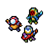
I did not mean to post the shadow look. Here he is so far now...

You need to change the pallet color to 3 to see his real look.
_________________
I drew my Icon!
My forums:
http://www.freeforum101.com/*coming soon* |
|
| Back to top |
|
|
The Wobbler
Joined: 06 Feb 2003
Posts: 2221
|
| Posted: Sun Jan 21, 2007 8:54 pm Post subject: |
|
|
| Note from Castle Paradox Administration: | | This content has been removed by the user. Contact the original author and link them to this post if you wish to view the original content. Only the author can remove the tags hiding this content. |
|
|
| Back to top |
|
|
Chaotix
Has a fan!
Joined: 03 Oct 2006
Posts: 205
Location: That one place
|
| Posted: Sun Jan 21, 2007 8:57 pm Post subject: |
|
|
Click on IMPORT WITH PALLET. That is how I do it.
My screenshots come out all black and grainy.
_________________
I drew my Icon!
My forums:
http://www.freeforum101.com/*coming soon* |
|
| Back to top |
|
|
Calehay
...yeah.
Class B Minstrel
Joined: 07 Jul 2004
Posts: 549
|
| Posted: Sun Jan 21, 2007 9:01 pm Post subject: |
|
|
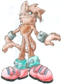
It's still a JPEG, so your intentions aren't going to come out. The way it is right now, this character has too many colors to work in the OHR. Also, if you look closely, the black has a bunch of shades of grey. I would bet that if you tried to put this in the OHR, it would come out looking completely odd.
Also, the colors on your flame is a little too dark. Also, remember this; Flames are hottest in the middle, and a hotter flame tends to get white. With your picture, the flame is getting cooler on the inside and hotter on the outside.
If you haven't saved another file in a different format, you can still you the lineart of the JPEG to get yourself started, but you'll still have to start over.
Also, can I suggest that you use Imageshack:
http://imageshack.us/
They have a checkbox so that you can turn off the linking.
Also, it would probably be a good idea to work on a different background than black. Pink would be a good choice, though you'll have to change it when you put it back into the OHR.
_________________
Calehay |
|
| Back to top |
|
|
Newbie_Power

Joined: 04 Sep 2006
Posts: 1762
|
| Posted: Sun Jan 21, 2007 9:01 pm Post subject: |
|
|
Ok. I am going to make some actual suggestions.
Your flame on the head looks fine, believe it or not. A little hairlike, but good for someone drawing flames for their first time. EDIT: Or follow Calehay's suggestion.
What I do not like is not how you handle the shading or any of that stuff... It's the hand and feet placement, because even with removing the body completely, you STILL have to deal with creating a 3D space. You designed the feet to suggest that your character is standing at an angle, but your hands say that your character is standing right in front of me, creating imbalance.
The solution I propose to fix this is to make the left hand smaller by a small amount to show that it is a little farther away, shift the right hand downward, and make the left foot smaller as well. |
|
| Back to top |
|
|
Chaotix
Has a fan!
Joined: 03 Oct 2006
Posts: 205
Location: That one place
|
| Posted: Sun Jan 21, 2007 9:05 pm Post subject: |
|
|
First off, he is floating. But I really like your suggestion. Though it will be his RIGHT side that gets smaller, not left.
I looked at the flame tutorial thing, so I might be able to get it a little better!
_________________
I drew my Icon!
My forums:
http://www.freeforum101.com/*coming soon* |
|
| Back to top |
|
|
Newbie_Power
Joined: 04 Sep 2006
Posts: 1762
|
| Posted: Sun Jan 21, 2007 9:08 pm Post subject: |
|
|
| Quote: | | First off, he is floating. But I really like your suggestion. Though it will be his RIGHT side that gets smaller, not left. |
WTF? This is a battle sprite. It'll look more like he's facing right if you do that.
If he's floating, then make the left side smaller anyway, just not by much. I didn't tell you to change how the feet are actually pointed down like that. |
|
| Back to top |
|
|
The Wobbler
Joined: 06 Feb 2003
Posts: 2221
|
| Posted: Sun Jan 21, 2007 9:10 pm Post subject: |
|
|
| Note from Castle Paradox Administration: | | This content has been removed by the user. Contact the original author and link them to this post if you wish to view the original content. Only the author can remove the tags hiding this content. |
|
|
| Back to top |
|
|
Calehay
...yeah.
Class B Minstrel
Joined: 07 Jul 2004
Posts: 549
|
|
| Back to top |
|
|
Chaotix
Has a fan!
Joined: 03 Oct 2006
Posts: 205
Location: That one place
|
| Posted: Sun Jan 21, 2007 9:12 pm Post subject: |
|
|
Should not I want that, since he is a good guy? You have got me all confused.
Oh wait I get it. You are refering to Left as his RIGHT side of his body. Am I right?
_________________
I drew my Icon!
My forums:
http://www.freeforum101.com/*coming soon* |
|
| Back to top |
|
|
TwinHamster
♫ Furious souls, burn eternally! ♫
Joined: 07 Mar 2004
Posts: 1352
|
| Posted: Sun Jan 21, 2007 9:14 pm Post subject: |
|
|
| Chaotix wrote: | Should not I want that, since he is a good guy? You have got me all confused.
Oh wait I get it. You are refering to Left as his RIGHT side of his body. Am I right? |
...Left, as in the player's left. And the player's left should be the hero's front, not his right. Otherwise, the hero would be facing the player. |
|
| Back to top |
|
|
Fenrir-Lunaris
WUT
Joined: 03 Feb 2003
Posts: 1747
|
| Posted: Sun Jan 21, 2007 9:18 pm Post subject: |
|
|
 Here is how the hero should look. Looking towards the LEFT of the screen, where the enemies are. You also see how he's colored? How you can actually make out details on his sprite? Your sprite should be the same way, so we can see his eyes, and other features. The shadow under him is also quite simple to do - just color in some black on the bottom where his feet are and you're done. Here is how the hero should look. Looking towards the LEFT of the screen, where the enemies are. You also see how he's colored? How you can actually make out details on his sprite? Your sprite should be the same way, so we can see his eyes, and other features. The shadow under him is also quite simple to do - just color in some black on the bottom where his feet are and you're done. |
|
| Back to top |
|
|
Chaotix
Has a fan!
Joined: 03 Oct 2006
Posts: 205
Location: That one place
|
| Posted: Sun Jan 21, 2007 9:19 pm Post subject: |
|
|
That file is a .bmp I drew it in the OHR and ripped it out. Then hosted it. So it will work fine putting it in the ohr, since that is where he came from.
That is why it looks as good as it does. If i drew it in ms paint, you would likly throw up at the site of it.
_________________
I drew my Icon!
My forums:
http://www.freeforum101.com/*coming soon* |
|
| Back to top |
|
|
The Wobbler
Joined: 06 Feb 2003
Posts: 2221
|
| Posted: Sun Jan 21, 2007 9:24 pm Post subject: |
|
|
| Note from Castle Paradox Administration: | | This content has been removed by the user. Contact the original author and link them to this post if you wish to view the original content. Only the author can remove the tags hiding this content. |
|
|
| Back to top |
|
|
|


