 |
Castle Paradox
|
| View previous topic :: View next topic |
| Author |
Message |
Machu
Righter, a person who rights wrongs

Joined: 09 Jul 2003
Posts: 737
|
 Posted: Wed Jun 01, 2005 10:28 am Post subject: Mr. Pixel voting thread (dang lot of images) Posted: Wed Jun 01, 2005 10:28 am Post subject: Mr. Pixel voting thread (dang lot of images) |
 |
|
This is where you post your ratings on all of the entries.
Scores are between 0 and 10, 10 is the highest.
You must give a score for each entry.
Voting goes until the end of June 7th.
And goddamnit, people, vote seriously. Do not give good art low scores because of personal bias or poor art high scores just to be funny, and vice versa.
Here are the entries that made it. A few entries have broken links and I haven't saved them, sorry.
 Derek, by Ysoft_Entertainment Derek, by Ysoft_Entertainment
 Mr. BA Remus, by Gizmog1 Mr. BA Remus, by Gizmog1
 Dinosaur Pointless, by PHC Dinosaur Pointless, by PHC
 Earl, by PHC Earl, by PHC
 Jerk, by PHC Jerk, by PHC
 Thomas, by Uncommon Thomas, by Uncommon
 Zack, by Fortis Zack, by Fortis
 Stickman, by J'sang'spar Stickman, by J'sang'spar
 Terrane, by rpgspotKahn Terrane, by rpgspotKahn
 Pipo, by rpgspotKahn Pipo, by rpgspotKahn
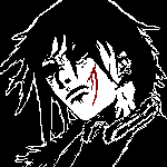 Infinity, by Shadowiii Infinity, by Shadowiii
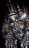
 Keron 7, by Sephyroth Keron 7, by Sephyroth
 The Gold Knight, by Sephyroth The Gold Knight, by Sephyroth
 Sorceror Kezef, by Fenrir-Lunaris Sorceror Kezef, by Fenrir-Lunaris
 Damien Loki, by Ssalamanderr Damien Loki, by Ssalamanderr
 Diago, by rpgspotkale Diago, by rpgspotkale
 Jason Voorees, by Tsunamidog Jason Voorees, by Tsunamidog
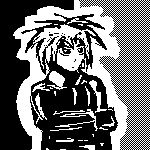
 Tim Taylor, by Machu Tim Taylor, by Machu
 Gilbert Smith, by Machu Gilbert Smith, by Machu
 Adrian, by Adrianx Adrian, by Adrianx
 Herb Rushman, by LeRoy_Leo Herb Rushman, by LeRoy_Leo
EDIT: There, now later save people time and don't use .bmp, okay?
_________________
| Code: | [*]That's it
[*]I'm done reasoning with you
[*]Starting now, there's going to be a lot less conversation and a lot more killing |
Last edited by Machu on Wed Jun 08, 2005 1:16 pm; edited 1 time in total |
|
| Back to top |
|
 |
Hachi-Roku
From now until forever.
Joined: 10 Feb 2003
Posts: 46
Location: TX
|
| Posted: Wed Jun 01, 2005 12:06 pm Post subject: |
|
|
Derek, by Ysoft_Entertainment - 3
Mr. BA Remus, by Gizmog1 - 1
Dinosaur Pointless, by PHC - 4
Earl, by PHC - 3
Jerk, by PHC - 0
Thomas, by Uncommon - 10
Zack, by Fortis - 8
Stickman, by J'sang'spar - 0 (even though it is an exact recreation of Stickman)
Terrane, by rpgspotKahn - 6
Pipo, by rpgspotKahn - 5
Infinity, by Shadowiii - 10
Keron 7, by Sephyroth - 6
The Gold Knight, by Sephyroth - 7
Sorceror Kezef, by Fenrir-Lunaris - 10
Damien Loki, by Ssalamanderr - 5
Diago, by rpgspotkale - 9
Jason Voorees, by Tsunamidog - 0
Tim Taylor, by Machu - 6
Gilbert Smith, by Machu - 4
Adrian, by Adrianx - 7
Herb Rushman, by LeRoy_Leo - 7
_________________
Long road ahead. Ready to walk? |
|
| Back to top |
|
|
The Wobbler
Joined: 06 Feb 2003
Posts: 2221
|
| Posted: Wed Jun 01, 2005 12:21 pm Post subject: |
|
|
| Note from Castle Paradox Administration: | | This content has been removed by the user. Contact the original author and link them to this post if you wish to view the original content. Only the author can remove the tags hiding this content. |
Last edited by The Wobbler on Wed Jun 01, 2005 1:15 pm; edited 1 time in total |
|
| Back to top |
|
|
Me
HI.
Joined: 30 Mar 2003
Posts: 870
Location: MY CUSTOM TITLE CAME BACK
|
| Posted: Wed Jun 01, 2005 12:47 pm Post subject: |
|
|
Derek: 2 (boring)
Remus: 7 (minimalism ftw)
Pointless: 8 (funny)
Earl: 3 (meh)
Jerk: 3 (meh)
Thomas: 10 (woot)
Zack: 10 (ANGST)
Stickman: 10 (bestest gaym ever)
Terrane: 5 (meh) 
Pipo: 7 (interesting, but flat flat flat)
Infinity: 9 (ANGST)
Keron: 8 (b/w)
Gold: 5 (boring)
Kezef: 10 (INSANITY)
Loki: 1 (meh)
Diago: 8 (would be higher but fuzzy and no face :( ) 
Jason: 1 (ew)
Tim: 8 (propotions off, but ACTIONy)
Gilbert: 8 (kinda faggy)
Adrian: 4 (boring, squishy)
Herb: 10 (I like)
_________________
UP DOWN UP DOWN LEFT LEFT RIGHT RIGHT A B START |
|
| Back to top |
|
|
Gizmog1
Don't Lurk In The Bushes!
Joined: 05 Mar 2003
Posts: 2257
Location: Lurking In The Bushes!
|
| Posted: Wed Jun 01, 2005 1:01 pm Post subject: |
|
|
Ysoft's Deliciously Generic Derek:2
Gizmog's Brilliantly Black B.A. Remus:3
PHC's Pointlessly Powerful Dinosaur: 4
PHC's Excessively Obese Earl:7
PHC Jerk's It: 3
Uncommon's Tenacious Thomas:7
Smoldering PK-Fortis' Zack Attack:5
Jsang's Swag SWAC Giveaway:7
KAAAAAAAAAAAAAHN: 4
Khan's Pied Piper of Pain: 2
Shadow's Michael Myers: 5
Lt. Beeker, by Sephy: 3
Sephy's Golden Shower: 5
Fenrir's Phantom of the Opus: 6
Ssalamander's 2Dark2C Camoflage: 2
KAAAAAAAAAAAAALE: 4
Jason Voorhees: Disqualification.
Someone Cut Me New Eye Holes, by Machu: 7
A Machuvellian Self Portrait: 8
Adrian's Trademark Contest Entry: 2
Leroy's "Herbal" Rush: 4 |
|
| Back to top |
|
|
Machu
Righter, a person who rights wrongs
Joined: 09 Jul 2003
Posts: 737
|
| Posted: Wed Jun 01, 2005 1:02 pm Post subject: |
|
|
Derek: 3, rather plain.
Mr. Remus: 1, for some reason, the gold tooth gives personality. still lazy, though.
Dinosaur: 2, I'd kill it.
Earl: 6, teehee, suprisingly good use of lineart-style.
Jerk: 2, Housemaster turned Japanese!
Thomas: 8, major style points.
Zack: 5, ironically generic.
Stickman: 0, wait, wasn't there a "Stickman with chainsaw" character?
Terrane: 5, pretty good, but messy in the wrong way.
Pipo: 6, has more style, but still confusing.
Infinity: 9, this started the whole angst bandwagon, and rightfully so.
Keron: 7, a good attempt at following it.
Gold Knight: 7, also good.
Kezef: 9, all of that hair and angst makes for great detail. Perhaps too much detail.
Damien: 5, a good start.
Diago: 4, good drawing and design, but the coloring looks "program-made" and goes against the pixel theme.
Jason: 1, the smoke blown through the mask is good, I guess.
Tim: 8, more kung-fu than five Bruce Lees.
Gilbert: 10, hot damn!
Adrian: 7, definately a step up, though the face is kinda wierd.
Herb: 8, lots of personality.
_________________
| Code: | [*]That's it
[*]I'm done reasoning with you
[*]Starting now, there's going to be a lot less conversation and a lot more killing |
|
|
| Back to top |
|
|
Shadowiii
It's been real.

Joined: 14 Feb 2003
Posts: 2460
|
| Posted: Wed Jun 01, 2005 1:02 pm Post subject: |
|
|
Where's rinku's?
_________________
But enough talk, have at you! |
|
| Back to top |
|
|
Gizmog1
Don't Lurk In The Bushes!
Joined: 05 Mar 2003
Posts: 2257
Location: Lurking In The Bushes!
|
| Posted: Wed Jun 01, 2005 1:04 pm Post subject: |
|
|
| Shangri-la. |
|
| Back to top |
|
|
Ssalamanderr
Simply too strong. Simply too beautiful!
Joined: 14 Feb 2003
Posts: 208
Location: Out somewhere, Chillaxing.
|
| Posted: Wed Jun 01, 2005 1:11 pm Post subject: |
|
|
Derek-4 Could use shading, not a lot of personality
Mr. BA Remus- 4 Interesting Idea, but looks quickly done
Dinosaur Pointless- 5 Gotta love pointless stuff
Earl- 3 Huh?
Jerk- 4 interesting... the colours, they burn.
Thomas- 7 Like the style this was done in.
Zack- 6 yay for angst!
Stickman- 1 You get an F for "Effort"
Terrane-8 This looks really good, nice expression
Pipo- 6 Well drawn, but what the heck is it?
Infinity- 9 Looks awesome, well done.
Keron- 9 Like the shadows, He just looks so evil....
Gold Knight- 8 Really well done
Kezef- 9 PSYCHOTIC!!
Damien Loki- 3 GAH! What was I doing?
Diago- 9 Interesting angle (?), nice colour
Jason Voorees- 1 abuh?
Time Taylor- 8 Nice pixellating
Gilbert Smith-7 Ditto, but odd pose
Adrian- 7 looks good
Herb Rushman- 9 Lots of personality, nice pixellating
_________________
Ssalamanderr's Journal!: http://www.livejournal.com/users/ssalamanderr/
Ukelele no good! |
|
| Back to top |
|
|
Iblis
Ghost Cat

Joined: 26 May 2003
Posts: 1233
Location: Your brain
|
| Posted: Wed Jun 01, 2005 3:00 pm Post subject: |
|
|
Y_Soft - Derek: The hair is nonsensical (why all those crazy lines on it?) and it's just kinda boring to look at. 3/10
Giz - BA Remus: Kind of funny to look at, I guess. Otherwise uniniteresting. 2/10
PHC - Dinosaur Pointless: I don't remember this character but it's a funny pic. Are those little circles under its head boobs? More eyes? It is hard to tell. Great expression. 7/10
PHC - Earl: Both characters look great. Well, the girl looks horrible but in a funny way. Less interesting than the above picture though. 6/10
PHC - Jerk: Ha. Horrible but kind of amusing. 3/10
Uncommon - Thomas: So much awesome. 10/10
Fortis - Zach: Very nice, though the caption is indeed pretty lame, and the coloring could be better. 9/10
Jsang - Stickman: Meh. 1/10
Kahn - Terrane: Hair is ugly and so is the thick white border around him. There's not much interesting about this one, but I guess the face looks okay. 4/10
Kahn - Pipo: What the fuck is going on here? I mean, really, what? I can see a guy, and it looks like he's holding a demon baby to his chest or something. And then there's random white shit to the side. EXPLAIN YOURSELF NOW. 2/10
Shadowiii: Infinity: This is pretty awesome and creepy. I like that it's moderately detailed without cluttering the picture with crap. The white outlines look a little awkward to me, but it's otherwise great. 9/10
Sephyroth - Keron 7: Very cool. I like this better than Shadow's, actually. Good use of shadow (lol pun). 10/10
Sephyroth - Gold Knight: It's nice I guess. Not really that interesting. 5/10
Fenrir - Kezef: Great looking pic. The shading is very well done. 9/10
Ssalamanderr - Damien Loki: I can hardly see it and what I can see doesn't look that impressive. 3/10
Kale - Diago: Is he wearing armor or a fancy jacket or what? It looks kind of neat I guess. No face is lame though. 6/10
Tsunamidog - Jason: FAIL. There's really nothing good about this. 1/10
Machu - Tim Taylor: Proportions are a bit awkward and the arms look rather like sticks (these are problems in most of the sprites I've seen by you). Still a decent rendition of Tim Taylor though. 6/10
Machu - Gilbert: Better than the Tim sprite but still has the same problems to a lesser degree. Right upper arm looks weird. Head is pretty good though. 7/10
AdrianX - Adrian: Pretty well drawn. The eyes are way huge though, even for anime. Also it's kind of dull. He's just staring, not doing any kind of interesting expression or pose. 6/10
Leroy - Herb Rushman: This is pretty good. I like the shading and the expression, they're well done. Background should probably have more contrast. JPG is bad, but I won't be lowering your score for that. 8/10
_________________
Locked
OHR Piano |
|
| Back to top |
|
|
The Wobbler
Joined: 06 Feb 2003
Posts: 2221
|
| Posted: Wed Jun 01, 2005 3:05 pm Post subject: |
|
|
| Note from Castle Paradox Administration: | | This content has been removed by the user. Contact the original author and link them to this post if you wish to view the original content. Only the author can remove the tags hiding this content. |
Last edited by The Wobbler on Wed Jun 01, 2005 3:17 pm; edited 1 time in total |
|
| Back to top |
|
|
Fernurion
Village Idiot

Joined: 19 Aug 2003
Posts: 192
Location: Lost
|
| Posted: Wed Jun 01, 2005 3:06 pm Post subject: |
|
|
Ysoft's Derek: 4
Not too bad, but the mirrored image makes it odd to look at and the eyes look like they're trying to burn a hole in my skull.
Giz's BA Remus: 2
Funny, and good for what it is.
PHC's Dinosaus Pointless:5
Another funny one.The second face looks great, but the extra eye just looks odd.
PHC's Earl: 5
Again, the face looks great. His arm is a bit short though. He looks like my old math teacher.
PHC's Jerk: 6
Looks like it came straight from a game (Custom.exe?). His second arm (It is an arm, right?) should not be there.
Uncy's Thomas: 7
I'm not a fan of monochrome pixel art, but this is excellent.
Fortis's Zack: 6
I like the cartoony look, but the shading looks wrong, especially the hair.
J'sang'spar's Stickman: 1
That chainsaw reminds me of Wingedmene's sword.
kahn's Terrane: 7
Not bad. His eyes look a bit weird
Kahn's Pipo:5
Ooh, a bad guy. The second head looks like it was hastily drawn and his hand, a first glance looks like it's attached to a bare bone.
Shadow's Infinity: 6
Sinister. Very well done. The bleeding scar is a nice touch. His clothes lack definition though.
Sephy's keron 7: 6
The eyes look good, but the way the seam of his shirt continues through the shadow dosn't look right.
Sephy's The Gold Knight: 5
Nice. The symbol on his headband isn't right, and he has a very malnourished look about him.
Fenrir's Sorcerer kezef:8
What is that under his chin? Aside from that, this picture is excellent.
Ssalamanderr's Damien Loki:7
Quite good. His left arm seems to lack an elbow, and the hat looks like a diaper.
Kale's Diago: 8
Great, if you like chins and torsos. The glowing effect looks really nice.
T-Dog's Jason Voorees:3
It looks like a man in a ski mask smoking. It needs detail, and he needs copious amounts of blood on him to be a decent jason.
Machu's Tim Taylor:8
He looks like he should be dancing. A lot of effort went into this one.
Machu's Gilbert Smith: 8
Elvis, in lycra, with a croquet(spelling?) mallet. Does he have to have his underware on the outside?
Adrian's Adrian : 6
His eyes are a bit big, and his eyebrows overlay his hair. judging by his collar, his head is a bit too small for his body.
Leroy's Herb Rushman:7
Looks like a gorilla. His body and arms look good, the face is a little off-putting though. |
|
| Back to top |
|
|
Ishrie

Joined: 17 Apr 2004
Posts: 39
Location: The middle of nowhere. ;)
|
| Posted: Wed Jun 01, 2005 4:47 pm Post subject: |
|
|
3, Derek, by Ysoft-- Not too bad for a beginner, but the mirrored face really bugs me.
4, Mr. BA Ramus, by Gizmog1-- If viewed as most of these are originally inteded (as a person), this is severely lacking, but when viewed as an individual piece, it's decent. Would've been better with more detail, though.
4, Dinasaur Pointless, by PHC-- This frightens me. It sincerely frightens me.
2, Earl, by PHC-- Also frightens me... Earl(I'm assuming that's the fat man's name)looks okay if you are going for cartoonism, but the girl's anatomy and proportions are off- doesn't suit the picture at all.
0, Jerk, by PHC-- I honestly don't believe that any effort was put into this..
6, Thomas, by Uncommon-- Nicely done. It's a little off-balance, though.
4, Zack, by Fortis-- Needs more detail...
0, Stickman, by J'sang'spar-- Less work was put into this than Jerk.
3, Terrane, by rpgspotKahn -- Nice, but the pixil-ey look of the character doesn't work with the picture at all... The eyes also bother me, but that may just be a stylistic preference.
6, Pipo, by rpgspotKahn-- Here, the pixil look works just fine. It is fairly well balanced and just a little eerie.
7, Infinity, by Shadowiii-- The contrast with the detail of the face with the lack in the hair compliments this very well.
5, Keron 7, by Sephyroth-- Creepy...
4, The Gold Knight, by Sephyroth-- Nice try, but the shading and anatomy of the face is off..
10, Sorceror Kezef, by Fenrir-Lunaris-- OH. MY. GOD. It's going to eat me...!
4, Damien Loki, by Ssalamanderr-- Good, but fairly disproportionate, and the background is destracting...
9, Diago, by rpgspotkale-- Very well-cropped, with lovely coloring. The way the mouth's shape is drawn sticks out a bit too much for liking, though..
0, Jason Voorees, by Tsunamidog-- An MSPaint nightmare...
8, Tim Taylor, by Machu-- Nice anatomy and pose, but it is pretty uninteresting...
8, Gilbert Smith, by Machu-- Read above reason.
6, Adrian, by Adrianx-- The eyes are too large for his head, and the highlights are eye-catching, pixil-ey, and painful.
7, Herb Rushman, by LeRoy_Leo-- Nice, lovely shading and interesting, but the plain background killed it... Something a bit darker to contrast would be nice.
_________________
http://www.oddwebsite.com/ddw.php?tjord=11 |
|
| Back to top |
|
|
JSH357

Joined: 02 Feb 2003
Posts: 1705
|
| Posted: Wed Jun 01, 2005 5:03 pm Post subject: |
|
|
Ysoft: 2 - A bad attempt at copying the cheeseball anime style.
Gizmog: 2 - lol joke
PHC's Dinosaur Pointless: 6 - Looks good
PHC's Earl: 4 - Not as good, but has more character than most of 'em
PHC's Jerk: 1 - Can I give zeroes? The WA and KOKORO are blinding me
Uncy: 9 - Most interesting of all of these
Fortis: 8 - It's good
Jsangspar: 5 - You have to have played the game
Terrane: 7 - I'm glad half the entries are black and white
Pipo: 7 - Also very good
Infinity: 7 - Nevermind, these are getting repetitive
Keron 7: 6 - Ditto
Gold Knight: 2 - Oogly
Fenrir: 8 - Much better than the last one
Damien Loki: 5 - Good, doesn't match up to the others
Diango: 6 - Not seeing the face kills the picture for me. Faces = good
Tsunamidog: 1
Tim Taylor: 8 - This is awesome
Gilbert: 6 - I don't like the arms on this one
Adrian: 3 - It's okay for a portrait, but I really hate the eyes overlapping hair thing
Leroy: 5 |
|
| Back to top |
|
|
Shadowiii
It's been real.
Joined: 14 Feb 2003
Posts: 2460
|
| Posted: Wed Jun 01, 2005 5:39 pm Post subject: |
|
|
I will rank like a butthole!
Ysoft - 3 - Need to learn shading, and the ears and hair are weardly akward, but the overall face shape isn't too bad.
Gizmog - 1 - THE TOOTH IS GOLD.
PHC (pointless) - 5 - LET ME DIE.
PHC (Earl) - 2 - ZOMG LOLI
PHC (Jerk) - 2 - AND THE TECHNICOLOR DREAM COAT
Uncommon - 11 - THANK YOU WILL BUY AGAIN (BEST OF SHOW)
Zack - 6 - JOKE IS GETTING OLD BUT I LIKE HIS ANGST HOORAY FOR EMO
JSING - 2 - PLEASE KILL ME :( << LET ME DIE?!
rpgspotKahn (Terrance) - 6 - LOL CLOD OMNISLZH
rpgspotKahn - 1 - WTF?!
Shadowiii - INFINITY/10 LOL OLOL 8 - SHIRT NEEDS WORK LIKE THE ANGST
Seffy (Keron) - 7.5 - ZOMG EVERYONE JUMPED ON MY IDEA U STOLE MY IDEA AGAIN SEFFY!11!! H8 JOO!!!
Seffy (Gold Nyte lol) - 5 - THE SHADING IS DISTURBING ALL SEEING EYE ON TEH HAT?
Fenrir - 10 - VERY NICE WHY IS HIS FACE DEKAYING I AM KONFUZED :(
Ssalamander - 3.5 - NEED SOME SHADING BUT HE HAS GREEN FIRE POWER
rpgspotkale - 5.5 - NICE BUT NO FACE WTF? CANNOT SEE HIS HAWTNESS :( :( :(
Tsunamidog - 0 - READ TEH RULZ NUB LOL I MEEN PLZ GET BETTER <---KONSTRUCTIVE CRITIZIM!
Machu (Tim Taylor) - 7 - ACTION.
Machu (Gilbert) - 7.5 - ELVIS.
Adrianx - 5 - SEEN IT B4 BUT STILL NICE GJ DOOD GJ
Leroy_leo - 5.5 - REMINDS ME OF MARCO FROM METTL SLG :D
Rinku - 63571346456987234590876 - ZOMG CLEVER
_________________
But enough talk, have at you! |
|
| Back to top |
|
|
|
|
You cannot post new topics in this forum
You cannot reply to topics in this forum
You cannot edit your posts in this forum
You cannot delete your posts in this forum
You cannot vote in polls in this forum
|
Powered by phpBB © 2001, 2005 phpBB Group
|

