| View previous topic :: View next topic |
| Author |
Message |
NeoTA
Idiomatic Nomenclature

Joined: 15 Mar 2004
Posts: 165
|
 Posted: Sun Oct 24, 2004 7:40 am Post subject: Stand back if you value your nose, and watch the pixels fly! Posted: Sun Oct 24, 2004 7:40 am Post subject: Stand back if you value your nose, and watch the pixels fly! |
 |
|
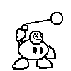
Four E's are necessary and sufficient!:

(drafty)
"The emperor wishes me to convey his utmost apologies to you. Perhaps we can arrange a meeting some .. other time."

I drew the original in grey on a icky green background. I added the shoulders and neck after
coloring the head basically. the rest was added in 32-pixel segments.
Crossposted from Pixelation. because the colors are amazing and deserve more exposure. |
|
| Back to top |
|
 |
LeRoy_Leo
Project manager
Class S Minstrel
Joined: 24 Sep 2003
Posts: 2683
Location: The dead-center of your brain!
|
| Posted: Sun Oct 24, 2004 10:39 am Post subject: |
|
|
The tree is very interesting. I like how you can do the angle on it. 
The emperor made me laugh. His arms are a little oblong though. I can't say I like his hair, but that's his own business. Other than that, the emperor has some good details. Especially in the hair and pants.
Again; Good going, Neo!
_________________
Planning Project Blood Summons, an MMORPG which will incinerate all of the others with it's sheer brilliance...
---msw188 ---
"Seriously James, you keep rolling out the awesome like gingerbread men on a horror-movie assembly line. " |
|
| Back to top |
|
|
Sephyroth
Renegade Rebel Redmage
Class A Minstrel
Joined: 04 Feb 2003
Posts: 644
Location: Schmocation
|
| Posted: Sun Oct 24, 2004 5:42 pm Post subject: |
|
|
I'm a bit skeptical about the point of view in the first picture. Are we looking at the tree from above or below, because I see bits of both aspects.
The colors on the last one seem a bit weak and foggy, thought that was probably deliberate. The shading on his cape looks weird, the arms really are rather skinny, and the proportions of his legs might be a bit off (the last I'm not that sure about).
_________________
im realy ded  |
|
| Back to top |
|
|
NeoTA
Idiomatic Nomenclature
Joined: 15 Mar 2004
Posts: 165
|
| Posted: Sun Oct 24, 2004 5:48 pm Post subject: |
|
|
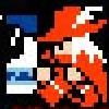
I decided i have to have a new picture for every post to this thread.
so here is a in-progress banner for pixelation, of great sparkliness.:

I like how i can do the angle on it too.. i would like it even more if i could figure out what the perspective at the very bottom of the tree should look like.
When i was drawing him, he didn't make me laugh, but as soon as i tried to mention him to others i went giggly.
He is supposed to be wearing pantaloons ala Prince Of Persia, i have not yet made them rounded or billowing enough.
Thanks!
Edit:
Sephiroth:
yes, i will adjust the contrast. and i've already made his arms thicker in the offline version. I'll upload it after I'm finished with the pants.
Edit2: Done! (contrast DOWNED, as this looks more like i wanted) |
|
| Back to top |
|
|
|

