 |
Castle Paradox
|
| View previous topic :: View next topic |
| Author |
Message |
Aussie Evil

Joined: 28 Apr 2009
Posts: 27
|
 Posted: Sun Jun 27, 2010 2:27 pm Post subject: Unused Tileset Posted: Sun Jun 27, 2010 2:27 pm Post subject: Unused Tileset |
 |
|
This was from the cancelled Battlesuits project.
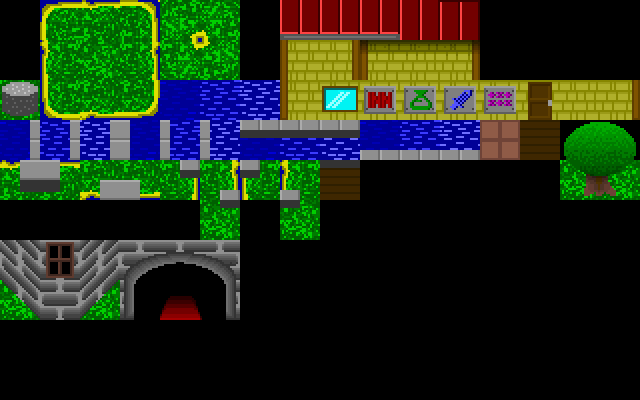
I know the grass texture sucks, but aside from that, any suggestions?
_________________
and you, sir, are no lady |
|
| Back to top |
|
 |
Sh4d0ws

Joined: 06 Nov 2009
Posts: 39
|
| Posted: Sun Jun 27, 2010 7:25 pm Post subject: |
|
|
You really need to spruce up the grass. Lower the contrast a bit by darkening the neon-green lines, and pick out all the details that make it obvious It's a repetitive tile.
Sand is rough in real life, isn't it? So make the sand in your tiles look rough! Take the two colors, or even add a median color, and "speckle" them throughout. You could also use some dithering there.
The water looks nothing like water! There are tons of different sources you could use to improve this, =namely other games and photos. Just look at other examples and find out yourself what you've done wrong. ( It should be pretty obvious. )
The building is fine enough. You could probably make things a bit more seamless by using bricks with dimensions dividable into 20.
The tree is a nice attempt. But It's too uniform, you should break up the outline of the leafy area to better simulate leaves. Change the lightsource, too. The perspective is overhead, about 30 - 45 degrees lower, so the light should be at the tip top of the tree. It should be a bit closer to the center.
The trunk is atrocious! The tree should be a lot taller. The roots are coming from only the front, -in real life, the come from all around the base. And you made it far too smooth! Use dithering and stippling and other techniques to give a rougher, bark-ier look.
The fortress is also terrible, in terms of texture anyways. You should use dithering to make the stones look rougher. NEVER use gradients, EVER. If it wouldn't look like that in real life, It shouldn't look like that in your game.
Also, the lighting on the doorway is confusing. It's coming from inside the castle, but a greater source should already be hitting it from above. fix that.
I suggest you read up on Tsugomo's tutorial. I'd link you to it, but i'm not aware of any working mirrors. |
|
| Back to top |
|
|
Aussie Evil
Joined: 28 Apr 2009
Posts: 27
|
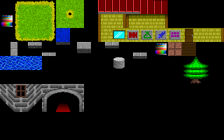
| Posted: Sat Jul 17, 2010 8:46 pm Post subject: |
|
|
_________________
and you, sir, are no lady |
|
| Back to top |
|
|
Sh4d0ws
Joined: 06 Nov 2009
Posts: 39
|
| Posted: Tue Aug 03, 2010 1:28 pm Post subject: |
|
|
wow, huge improvement! The tree, though, is terrible.What you've done to the poor thing is called pillow-shading, which is when you shade with no light-source. It's terrible looking, and should never, ever be used. Try shading down to the lower-right, so it follows your upper-left-ish lightsource.
Also, you should try posting in Slimesalad. It's a lot more active, and you'll be able to get more attention. |
|
| Back to top |
|
|
|
|
You cannot post new topics in this forum
You cannot reply to topics in this forum
You cannot edit your posts in this forum
You cannot delete your posts in this forum
You cannot vote in polls in this forum
|
Powered by phpBB © 2001, 2005 phpBB Group
|

