| View previous topic :: View next topic |
| Author |
Message |
Ssalamanderr
Simply too strong. Simply too beautiful!
Joined: 14 Feb 2003
Posts: 208
Location: Out somewhere, Chillaxing.
|
 Posted: Thu Mar 24, 2005 4:04 pm Post subject: Ssalamanderr's OHR art thread Posted: Thu Mar 24, 2005 4:04 pm Post subject: Ssalamanderr's OHR art thread |
 |
|


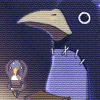
This is my standing frame for the main character of my game. It needs some work. I was working off of a concept sketch (unfortunately I don't have a scanner so I can't show you that). I need to work on the head (especially the eyes, there isn't enough space), knives and his left arm. Does anybody have any suggestions?
_________________
Ssalamanderr's Journal!: http://www.livejournal.com/users/ssalamanderr/
Ukelele no good!
Last edited by Ssalamanderr on Tue Apr 19, 2005 6:27 pm; edited 2 times in total |
|
| Back to top |
|
 |
Moogle1
Scourge of the Seas
Halloween 2006 Creativity Winner


Joined: 15 Jul 2004
Posts: 3377
Location: Seattle, WA
|
| Posted: Thu Mar 24, 2005 4:16 pm Post subject: |
|
|
He's... facing the screen. The enemies are to the left.
_________________
|
|
| Back to top |
|
|
Iblis
Ghost Cat

Joined: 26 May 2003
Posts: 1233
Location: Your brain
|
| Posted: Thu Mar 24, 2005 4:42 pm Post subject: |
|
|
Move the eyes one pixel down and one to the right. Then flip the sprite horizontally. That may be enough to fix the direction it's facing. Also use a darker green for the eyes to make them stand out more. And you have some lighter browns in your palette, use those to give the hair some highlights. It's just flat as it is. The knives could use an outline around them, it looks odd to have it on everything else except those.
_________________
Locked
OHR Piano |
|
| Back to top |
|
|
Ssalamanderr
Simply too strong. Simply too beautiful!
Joined: 14 Feb 2003
Posts: 208
Location: Out somewhere, Chillaxing.
|
| Posted: Thu Mar 24, 2005 6:30 pm Post subject: |
|
|
 I was trying to make it look like he was really confident and only just looking at the enemies. I was trying to make it look like he was really confident and only just looking at the enemies.
Whoops! Forgot about outlining the knives! I added them after I had done everything else.
Thanks you guys. I'm trying to do a basic pose before I get into all the crazy ones (this guy will has multiple sets of hero graphics). Your info is greatly appreciated.
_________________
Ssalamanderr's Journal!: http://www.livejournal.com/users/ssalamanderr/
Ukelele no good! |
|
| Back to top |
|
|
Iblis
Ghost Cat
Joined: 26 May 2003
Posts: 1233
Location: Your brain
|
| Posted: Thu Mar 24, 2005 6:40 pm Post subject: |
|
|
| Quote: | | I was trying to make it look like he was really confident and only just looking at the enemies. |
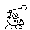
Well, right now his head is facing towards the screen and his body is angled to the right. He wouldn't be able to see the enemies at all. Confidence is nice, but anyone who doesn't face towards their enemies is a fool. Also if he tried to run from a battle it'd look like he was facing towards the enemies, which would look pretty weird.
_________________
Locked
OHR Piano |
|
| Back to top |
|
|
Ssalamanderr
Simply too strong. Simply too beautiful!
Joined: 14 Feb 2003
Posts: 208
Location: Out somewhere, Chillaxing.
|
| Posted: Thu Mar 24, 2005 7:01 pm Post subject: |
|
|


Ok, he's now looking at the enemies. On that first pic I moved his shoulder pad over to the other shoulder. It looks a bit more balanced I think.
What do you think of the colours? I tried a dark green for the clothes but he looks like a G.I. Joe...
Iblis, I tried your suggestion. It looked better, but his nose and hair was all messed up.
Maybe I should do more work on it before I post a new version. I havn't really changed that much. Maybe I'll post the smaller changes over on my livejournal.
Edit: Here he is with the body flipped around:

_________________
Ssalamanderr's Journal!: http://www.livejournal.com/users/ssalamanderr/
Ukelele no good! |
|
| Back to top |
|
|
LeRoy_Leo
Project manager
Class S Minstrel
Joined: 24 Sep 2003
Posts: 2683
Location: The dead-center of your brain!
|
| Posted: Sat Mar 26, 2005 11:28 pm Post subject: |
|
|
The flipped one looks like a better "battle stance" to me. The other way, where he is angled away from the enemies (sort of), is just a little too unrealistic. He would have a much easier time attacking (defending even) against the enemies if his body is at least angled towards his target(s). Just a thought.
_________________
Planning Project Blood Summons, an MMORPG which will incinerate all of the others with it's sheer brilliance...
---msw188 ---
"Seriously James, you keep rolling out the awesome like gingerbread men on a horror-movie assembly line. " |
|
| Back to top |
|
|
Ssalamanderr
Simply too strong. Simply too beautiful!
Joined: 14 Feb 2003
Posts: 208
Location: Out somewhere, Chillaxing.
|
| Posted: Tue Apr 19, 2005 6:26 pm Post subject: Hero V 2.0!!!!ONE!!!!11!! |
|
|

I just sort of spontaneously drew this today. I think it came out better than the first one, it's got more movement.
_________________
Ssalamanderr's Journal!: http://www.livejournal.com/users/ssalamanderr/
Ukelele no good! |
|
| Back to top |
|
|
Moogle1
Scourge of the Seas
Halloween 2006 Creativity Winner
Joined: 15 Jul 2004
Posts: 3377
Location: Seattle, WA
|
| Posted: Tue Apr 19, 2005 7:04 pm Post subject: |
|
|
Face is wonktastic. Legs are weird, too. First one was probably better all around.
_________________
|
|
| Back to top |
|
|
Shadowiii
It's been real.

Joined: 14 Feb 2003
Posts: 2460
|
| Posted: Wed Apr 20, 2005 9:32 am Post subject: |
|
|
I agree with moog, but the knives look way the heck better in the second one. Maybe just a few touch-ups?
_________________
But enough talk, have at you! |
|
| Back to top |
|
|
LeRoy_Leo
Project manager
Class S Minstrel
Joined: 24 Sep 2003
Posts: 2683
Location: The dead-center of your brain!
|
| Posted: Wed Apr 20, 2005 10:54 am Post subject: |
|
|
You got the right idea for a pose. You just need to watch proportions. Mainly body proportions. One leg sticks WAY too far out on the right and the left arm is twisted strangely. Keep trying. The pose is dynamic, just impossible.
_________________
Planning Project Blood Summons, an MMORPG which will incinerate all of the others with it's sheer brilliance...
---msw188 ---
"Seriously James, you keep rolling out the awesome like gingerbread men on a horror-movie assembly line. " |
|
| Back to top |
|
|
Gizmog1
Don't Lurk In The Bushes!
Joined: 05 Mar 2003
Posts: 2257
Location: Lurking In The Bushes!
|
| Posted: Wed Apr 20, 2005 7:58 pm Post subject: |
|
|
| It's a game, Leroy (I think). It doesn't have to be possible, so long as it isn't glaringly insane. I will admit, the legs bother me, but I think if he added a pixel or two of flesh color, and reduced the eye down to just 2 vertical pixels, instead of what looks like a 2x2 square, the face would be fine. The knives look a lot better, and he looks like he's actually going to fight this time. Perhaps, bring the right foot back a bit, over the left one, and move the right leg back to fit in with that move. Might help get rid of that mile long leg deal. |
|
| Back to top |
|
|
|

