 |
Castle Paradox
|
| View previous topic :: View next topic |
| Author |
Message |
The Drizzle
Who is the Drizzle?

Joined: 12 Nov 2003
Posts: 432
|
 Posted: Mon Mar 08, 2004 11:06 pm Post subject: Some hero graphics (updated Mar. 10) Posted: Mon Mar 08, 2004 11:06 pm Post subject: Some hero graphics (updated Mar. 10) |
 |
|
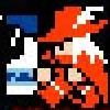
I added a couple more heroes and changed the outfits a bit.
     
I decided on a black outline with shadow. Check it out.

_________________
My name is...
The shake-zula, the mic rulah, the old schoola, you wanna trip? I'll bring it to yah...
Last edited by The Drizzle on Wed Mar 10, 2004 7:13 pm; edited 5 times in total |
|
| Back to top |
|
 |
Sephyroth
Renegade Rebel Redmage
Class A Minstrel
Joined: 04 Feb 2003
Posts: 644
Location: Schmocation
|
| Posted: Tue Mar 09, 2004 5:43 am Post subject: |
|
|
..wow...
These sprites are actually very nice! Keep up the good work!
..and, I think it looks better without the outline, but that's my own opinion.
_________________
im realy ded  |
|
| Back to top |
|
|
Shadowiii
It's been real.

Joined: 14 Feb 2003
Posts: 2460
|
| Posted: Tue Mar 09, 2004 7:39 am Post subject: |
|
|
Interesting style, they look rather nice. However, I'd recommend you outline them all, as they look a bit...flat without an outline.
1st One - Interesting stance, nice shading with the arms and the feet seem to be in a good pose. The only thing I disliked was the lack of a black outline, and that the collar of the shirt was a little...boring. But that's just me.
2nd One - The shoulder pad is to far over, it isn't really covering his actual shoulder its kinda....on top of the shoulder rather then on it. Also, that long strand of hair dangleing over there seems akward, though I will admit that something should be tehre to blanace out the picture. The ax is decent, though the handle is a bit thin. Also, his pants are up really high on his body (covering his abbs), which is a bit akward. Still, a nice sprite.
3rd One - My personal favorite of the three, though his eyes make me wan to scream  . The cloak is nice, though a bit small. His legs and feet are way to small for his body, but the outline dramatically improves this so...no worries. I also noticed in the outlined one you added more shading, which definatly helped (the cape). The one thing that really bugged me is that one pixel you removed from the bow. It was fine there when it wasn't outlined, but when you did outlin it it looked like a big hole. It needs that red pixel back. . The cloak is nice, though a bit small. His legs and feet are way to small for his body, but the outline dramatically improves this so...no worries. I also noticed in the outlined one you added more shading, which definatly helped (the cape). The one thing that really bugged me is that one pixel you removed from the bow. It was fine there when it wasn't outlined, but when you did outlin it it looked like a big hole. It needs that red pixel back.
Other then that, nice work, keep it up.
_________________
But enough talk, have at you! |
|
| Back to top |
|
|
The Drizzle
Who is the Drizzle?
Joined: 12 Nov 2003
Posts: 432
|
| Posted: Tue Mar 09, 2004 1:48 pm Post subject: |
|
|
About the first one: I'm having trouble adding any depth to the pants. Any suggestions?
About the second one: I noticed the shoulder pad thing shortly after posting and changed it, but I didn't update the picture. Trust me, it looks better.
About the third one: The reason the cloak is so short is that its really just the type to protect from the elements (rain, etc) not a cape. Realistically, a cape would get in the way of a fighter that has to be really mobile. Thus, the short cloak. Stealthy and practical. I also made the inside of his cape gray, which adds a lot of depth, but I didn't update the picture. And you're right about the bow string, too, and I'll fix it if I decide that black outlining is the way to go. But opinions seem mixed (though really, theres only two).
_________________
My name is...
The shake-zula, the mic rulah, the old schoola, you wanna trip? I'll bring it to yah... |
|
| Back to top |
|
|
LeRoy_Leo
Project manager
Class S Minstrel
Joined: 24 Sep 2003
Posts: 2683
Location: The dead-center of your brain!
|
| Posted: Tue Mar 09, 2004 2:30 pm Post subject: |
|
|
Th first one: Suggests that you try making the dark outline thicker. Make the outside of the pants on the side with the light source lighter. The center is lighter in other words. If you have extra space in your color pallet, maybe add a light grey.
Second One: Excellent. When will get to see the improved one? Also, maybe some quick detail. A light blotch of green in the center to show a rise in the chest perhaps? Meh...
Third One: Try the dark shade of the color the outline is touching, or grey for an out line (the first suggestion is best, but more difficult. Requires more shades of colors.) It looks more organic than black. I said that somewhere before... Black outlines are cartoony. 
In all, it all depends on the pallets. I would have one for each character's unique colors schemes, because hero grafics are very unique in that they can animate a little. But it's all good.
_________________
Planning Project Blood Summons, an MMORPG which will incinerate all of the others with it's sheer brilliance...
---msw188 ---
"Seriously James, you keep rolling out the awesome like gingerbread men on a horror-movie assembly line. " |
|
| Back to top |
|
|
Shadowiii
It's been real.
Joined: 14 Feb 2003
Posts: 2460
|
| Posted: Tue Mar 09, 2004 3:02 pm Post subject: |
|
|
| Quote: | In all, it all depends on the pallets.
::Leroy |
Very true. Always experiment by tampering with the pallets. I've noticed that (in the OHR at least) darkening the imgae areas tends to bring out some details, but...then you have a dark picture.
Anyway, if you change them, post 'em up so we can criticize comment on them!
_________________
But enough talk, have at you! |
|
| Back to top |
|
|
The Drizzle
Who is the Drizzle?
Joined: 12 Nov 2003
Posts: 432
|
| Posted: Tue Mar 09, 2004 4:37 pm Post subject: |
|
|
BTW, I'm leaning toward having a black outline. I think it makes some things look better-- however, it also takes away one color, which, surprisingly, actually makes a difference.
_________________
My name is...
The shake-zula, the mic rulah, the old schoola, you wanna trip? I'll bring it to yah... |
|
| Back to top |
|
|
Rpeanut
Chop Chop

Joined: 16 Mar 2003
Posts: 160
Location: dunno
|
| Posted: Tue Mar 09, 2004 4:51 pm Post subject: |
|
|
The art does look better with the outlines, and better fix that missing red dot. If you have any spare colors left on your paltte try adding another grey onto the pants to. Though the second guy (green axe weilder) might need some shading on the torso, overall good job. I like the 3rd and 4th ones best.
-------
Red Rogue XIII not [strike] Rpeanut [/strike] 
_________________
...eh? |
|
| Back to top |
|
|
LeRoy_Leo
Project manager
Class S Minstrel
Joined: 24 Sep 2003
Posts: 2683
Location: The dead-center of your brain!
|
| Posted: Tue Mar 09, 2004 4:51 pm Post subject: |
|
|
Regardless, the character design is quite well done. The detail is improved! And it is exceptionally incredible on the archer. I like how he reaches for his arrow in his stance. 
Do they have a shadows under them? It is quite easy to add, and I think it makes a sweet effect (difference).
_________________
Planning Project Blood Summons, an MMORPG which will incinerate all of the others with it's sheer brilliance...
---msw188 ---
"Seriously James, you keep rolling out the awesome like gingerbread men on a horror-movie assembly line. " |
|
| Back to top |
|
|
The Drizzle
Who is the Drizzle?
Joined: 12 Nov 2003
Posts: 432
|
| Posted: Tue Mar 09, 2004 4:59 pm Post subject: |
|
|
When they're outlined they have shadows, yes, and I agree, it looks much better. I think I'll go with it. A couple of questions though:
Would the girl holding the spear look better with brown gloves/boots/belt?
What would be a good color for the bow string? (If I did the black outline, I was considering just using that.)
I've used all of the colors for the Orc with the axe. With that in mind, what could be done to add some detail?
_________________
My name is...
The shake-zula, the mic rulah, the old schoola, you wanna trip? I'll bring it to yah... |
|
| Back to top |
|
|
LeRoy_Leo
Project manager
Class S Minstrel
Joined: 24 Sep 2003
Posts: 2683
Location: The dead-center of your brain!
|
| Posted: Tue Mar 09, 2004 5:33 pm Post subject: |
|
|
| LeRoy_Leo wrote: |
Do they have a shadows under them? |
Under them... Not just around them...
Gloves would certainly help gripping the spear...
Gold is a bit unrealistic and heavy, but that would be a cool color. So is the red you have. That is red, right?
I see you used the limit of 16 colors... So making a new pallet for him is a dumb suggestion. You only need three shades of the main body colors. You could even get by with two.
You only need one shade for the colors you don't use very much, like the red for his bands and loin cloth. You have three shades. I see a darker shade for under the shoulder pad. That might not be necessary. Ok, you decide though. You can free up a space to make for a lighter green for his body.
_________________
Planning Project Blood Summons, an MMORPG which will incinerate all of the others with it's sheer brilliance...
---msw188 ---
"Seriously James, you keep rolling out the awesome like gingerbread men on a horror-movie assembly line. " |
|
| Back to top |
|
|
Rpeanut
Chop Chop
Joined: 16 Mar 2003
Posts: 160
Location: dunno
|
| Posted: Tue Mar 09, 2004 5:55 pm Post subject: |
|
|
Red is perfect for the bow but maybe your suggestion for brown attaire is good, i knoww the back ground changes but the black blend into the background and is hard to see
_________________
...eh? |
|
| Back to top |
|
|
The Drizzle
Who is the Drizzle?
Joined: 12 Nov 2003
Posts: 432
|
| Posted: Tue Mar 09, 2004 5:57 pm Post subject: |
|
|
| Quote: | | Under them... Not just around them... |
I didn't mean the one that I posted, I meant the ones in my actual RPG file. Thanks for the palette suggestions too, btw.
_________________
My name is...
The shake-zula, the mic rulah, the old schoola, you wanna trip? I'll bring it to yah... |
|
| Back to top |
|
|
xaero
me

Joined: 30 Dec 2003
Posts: 101
Location: somewheres
|
| Posted: Tue Mar 09, 2004 6:40 pm Post subject: |
|
|
the second goblin dude has the best axe, and his chest has not much shading
________
no2 vaporizers
Last edited by xaero on Thu Feb 03, 2011 7:58 am; edited 1 time in total |
|
| Back to top |
|
|
The Drizzle
Who is the Drizzle?
Joined: 12 Nov 2003
Posts: 432
|
| Posted: Tue Mar 09, 2004 7:00 pm Post subject: |
|
|
I found the shading of his body to be a very touchy area. I used the most "natural orc skin color" green i could find, but the lighter ones are either too close to the normal skin tone and unnoticeable or too far. I chose the "too far" color because there's no point in making unnoticeable shading. However, too much of it makes him look shiny. So, I opted not to shade too much.
_________________
My name is...
The shake-zula, the mic rulah, the old schoola, you wanna trip? I'll bring it to yah... |
|
| Back to top |
|
|
|
|
You cannot post new topics in this forum
You cannot reply to topics in this forum
You cannot edit your posts in this forum
You cannot delete your posts in this forum
You cannot vote in polls in this forum
|
Powered by phpBB © 2001, 2005 phpBB Group
|

