| View previous topic :: View next topic |
| Author |
Message |
Battleblaze
Warrior Thread Monk
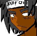
Joined: 19 Dec 2003
Posts: 782
Location: IndY OHR
|
 Posted: Fri Dec 19, 2003 12:35 pm Post subject: What works best fer u guys Posted: Fri Dec 19, 2003 12:35 pm Post subject: What works best fer u guys |
 |
|
When drawing my charecters in the walk abouts and battle scenes I like to have the colors solid and not much shadowing. but i noticed some people like to have a ton of differnt values for one color i guess to give it more depth. Sometimes it comes out funky and too light but I'd like to see other people's thought on drawing walkabouts
:flamedevil:
_________________
Indy OHR! and National OHR Month Contest going on now!
"Aeth calls PHC an anti-semite; PHC blames anti-semitism"
-squall |
|
| Back to top |
|
 |
Iblis
Ghost Cat

Joined: 26 May 2003
Posts: 1233
Location: Your brain
|
| Posted: Fri Dec 19, 2003 12:46 pm Post subject: |
|
|
Shading is better in almost every way I can think of.
And don't use that freaking emoticon so much.
_________________
Locked
OHR Piano |
|
| Back to top |
|
|
Sephyroth
Renegade Rebel Redmage
Class A Minstrel
Joined: 04 Feb 2003
Posts: 644
Location: Schmocation
|
| Posted: Fri Dec 19, 2003 12:47 pm Post subject: |
|
|
Funny, there used to be another guy on here called "Blazes Battle Inc.".. Well, anyways...
Personally, I like to use a lot of shading and such for my walkabouts. I really thinking having shadows makes the graphics look more professional than if you just used solid colors, though I'd be interested to look at some of your walkabouts before I make any assumptions.
Oh, and the flaming icon is annoying for some people. Don't use it too excessively.
_________________
im realy ded 
Last edited by Sephyroth on Fri Dec 19, 2003 12:47 pm; edited 1 time in total |
|
| Back to top |
|
|
Me
HI.
Joined: 30 Mar 2003
Posts: 870
Location: MY CUSTOM TITLE CAME BACK
|
| Posted: Fri Dec 19, 2003 12:47 pm Post subject: |
|
|
My thoughts are kill the burning smiley.
I thought that one was deleted. Please, don't spam with smileys.
Anyway, to the actual content of the post, I prefer shading and dithering. It looks better. Solid colors just look like crap to me.
_________________
UP DOWN UP DOWN LEFT LEFT RIGHT RIGHT A B START |
|
| Back to top |
|
|
Setu_Firestorm
Music Composer

Joined: 26 Mar 2003
Posts: 2566
Location: Holiday. FL
|
| Posted: Fri Dec 19, 2003 12:48 pm Post subject: |
|
|
It really all depends on the art style you want to use, Battle. Some people, like Komera, have a detailed art style that they stick with.
Some people, like Retrogamer, stick with an 8-bit NES look to their graphics. And some others, like RedMaverickZero, like a cartoon look to their graphics.
It all depends on what you want to do.
_________________

Facebook: http://www.facebook.com/georgerpowell
Newgrounds: http://setu-firestorm.newgrounds.com |
|
| Back to top |
|
|
Battleblaze
Warrior Thread Monk
Joined: 19 Dec 2003
Posts: 782
Location: IndY OHR
|
| Posted: Fri Dec 19, 2003 12:51 pm Post subject: |
|
|
My artist style is cartoonish (having todo with an anime obsession) but my walk abouts usally have a black outline and solid colors and at times it does look like crap but most of the time it works
_________________
Indy OHR! and National OHR Month Contest going on now!
"Aeth calls PHC an anti-semite; PHC blames anti-semitism"
-squall |
|
| Back to top |
|
|
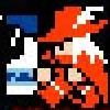
Komera

Joined: 07 Feb 2003
Posts: 711
|
| Posted: Fri Dec 19, 2003 1:50 pm Post subject: |
|
|
| Setu_Firestorm wrote: | | Some people, like Komera, have a detailed art style that they stick with. |
i'm not sure what me sticking with it has to do with anything... but i like detailed work.
my particular brand of ohr art actually comes in two flavors. my preference (see w;p1) is to give heros and enemies a dark cyan (i don't use black) outline and use (usually) two colors (sometimes three, usually in hair) for each area of color... giving it the ohr version of cell shading. the other style i use (see _zelda) is to use a monochromatic palette with no outline.
_________________
LJ.Art
SD - Ten creatures remaining. |
|
| Back to top |
|
|
Shadowiii
It's been real.

Joined: 14 Feb 2003
Posts: 2460
|
| Posted: Fri Dec 19, 2003 7:31 pm Post subject: |
|
|
Shading is, in my opinion, a must. Even in the 8 bit graphics, there still is a bit of shading somewhat. Unshaded graphics tend to be somewhat flat, which isn't a nice thing to do.
Just be sure you are consistant, that's all. If you make NPC's flat, make maptiles flat. Don't make them blazingly 3d Isomeric masterpieces, because it just won't work. Keep a similar style throughout the game, and it'll look better then if you have some brilliant hero graphic fighting a flat enemy.
As for the black outline, I personally use it liberally, because I dislike over-coloring. Be warned: just outlining tends to look a bit shabby. Black can be used to indent lines and curves in the body, or make a unit look more 3dish.
Uh, yeah.
_________________
But enough talk, have at you! |
|
| Back to top |
|
|
|

