| View previous topic :: View next topic |
| Author |
Message |
Calehay
...yeah.
Class B Minstrel
Joined: 07 Jul 2004
Posts: 549
|
 Posted: Sun Jan 21, 2007 9:24 pm Post subject: Posted: Sun Jan 21, 2007 9:24 pm Post subject: |
 |
|
| Chaotix wrote: | That file is a .bmp I drew it in the OHR and ripped it out. Then hosted it. So it will work fine putting it in the ohr, since that is where he came from.
That is why it looks as good as it does. If i drew it in ms paint, you would likly throw up at the site of it. |
That's interesting, considering the fact that when I right click it, it says that it is a JPEG.
If it really is a BMP that you saved, then the host is turning it into a JPEG. Please, please, pretty please, use ImageShack so that we can see what it actually looks like.
_________________
Calehay |
|
| Back to top |
|
 |
Newbie_Power

Joined: 04 Sep 2006
Posts: 1762
|
| Posted: Sun Jan 21, 2007 9:30 pm Post subject: |
|
|
| Just use Imageshack. It will take you A MAXIMUM OF ONE SECOND TO USE. There is NO REASON NOT TO USE IT. |
|
| Back to top |
|
|
Chaotix
Has a fan!

Joined: 03 Oct 2006
Posts: 205
Location: That one place
|
| Posted: Sun Jan 21, 2007 9:31 pm Post subject: |
|
|
Damned xs.to.
that is my hoster. That must be why my avatar looks bad. Any idea of a good new host?
I will check out Imageshack tomorrow. I need to go to bed. Schools in a few hours.
Well, 8 and a half hours. Talk to you all tomorrow. I hope to have image shack, and a better sprite by then!
_________________
I drew my Icon!
My forums:
http://www.freeforum101.com/*coming soon* |
|
| Back to top |
|
|
Newbie_Power
Joined: 04 Sep 2006
Posts: 1762
|
| Posted: Sun Jan 21, 2007 9:33 pm Post subject: |
|
|
| Imageshack isn't a "have". It's a "use". You feed it an image, it spits out the path on its server. Now you have an image that can easily be used with [img] tags. It takes about 1 second at most, and you can check it out right now without losing any sleep whatsoever. |
|
| Back to top |
|
|
Chaotix
Has a fan!
Joined: 03 Oct 2006
Posts: 205
Location: That one place
|
| Posted: Tue Jan 23, 2007 6:47 pm Post subject: |
|
|
I have used the ogrgfx thing, and it brings him out as the color pallet 1. How can I make him come out his proper color?
_________________
I drew my Icon!
My forums:
http://www.freeforum101.com/*coming soon* |
|
| Back to top |
|
|
The Wobbler
Joined: 06 Feb 2003
Posts: 2221
|
| Posted: Tue Jan 23, 2007 7:11 pm Post subject: |
|
|
| Note from Castle Paradox Administration: | | This content has been removed by the user. Contact the original author and link them to this post if you wish to view the original content. Only the author can remove the tags hiding this content. |
|
|
| Back to top |
|
|
TMC
On the Verge of Insanity
Joined: 05 Apr 2003
Posts: 3240
Location: Matakana
|
| Posted: Tue Jan 23, 2007 7:18 pm Post subject: |
|
|
If I recall, use the scroll bar at the bottom of the screen to change palette.
_________________
"It is so great it is insanely great." |
|
| Back to top |
|
|
Chaotix
Has a fan!
Joined: 03 Oct 2006
Posts: 205
Location: That one place
|
| Posted: Wed Jan 24, 2007 2:36 pm Post subject: |
|
|
opps. I never noticed it...
I will post a better version of the sprit, and host it on imageshack!
_________________
I drew my Icon!
My forums:
http://www.freeforum101.com/*coming soon* |
|
| Back to top |
|
|
Chaotix
Has a fan!
Joined: 03 Oct 2006
Posts: 205
Location: That one place
|
| Posted: Wed Jan 24, 2007 2:42 pm Post subject: |
|
|

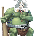
How is this one?
_________________
I drew my Icon!
My forums:
http://www.freeforum101.com/*coming soon* |
|
| Back to top |
|
|
The Wobbler
Joined: 06 Feb 2003
Posts: 2221
|
| Posted: Wed Jan 24, 2007 3:07 pm Post subject: |
|
|
| Note from Castle Paradox Administration: | | This content has been removed by the user. Contact the original author and link them to this post if you wish to view the original content. Only the author can remove the tags hiding this content. |
|
|
| Back to top |
|
|
Calehay
...yeah.
Class B Minstrel
Joined: 07 Jul 2004
Posts: 549
|
| Posted: Wed Jan 24, 2007 3:41 pm Post subject: |
|
|
I'm not quite sure what the character is doing. Particularly the legs are hard to read. Are the legs just straight lines, or are they like normal human legs that are bent at the knee? I'm making an edit at the moment that should help give you ideas about that (I'm not anywhere near good with pixel art, but it should give you some ideas.) but I won't post it until you tell me if it is okay for me to make an edit.
EDIT: One of the biggest things that I am noticing, even in your design, is that you're not thinking of the character as a chestless body, but as five balls. with that, you aren't really putting things in areas that's easy to read. Try this; create a silhouette of a character in the flying position that you want. Then, using your design, place the 5 parts of the body in their approriate design.
Another thing that you might consider is changing the pose. Since he is flying, you have to make sure that it looks like that. Right now, it looks like he's just standing on really crooked legs. Maybe you could have him a bit rotated, or maybe keep him oriented and raise one leg. The shadow will be crucial if you keep him in this orientation, as it will tell us how far he is from the ground.
_________________
Calehay |
|
| Back to top |
|
|
RedMaverickZero
Three pointed, red disaster!
Halloween 2006 Creativity Winner


Joined: 12 Jul 2003
Posts: 1459
|
| Posted: Thu Jan 25, 2007 6:58 am Post subject: |
|
|
| Chaotix wrote: |
How is this one? |
I'd say poor choices of color for fire. Fire is bright and flashy, not... dark. And if he's just a bunch of floating orbs, then you can do better than that. It looks like ya didn't try all that hard. |
|
| Back to top |
|
|
MADSOFT Games
Representing more than 80% of the internet!
Joined: 06 Nov 2004
Posts: 221
Location: AWESOME land
|
|
| Back to top |
|
|
Chaotix
Has a fan!
Joined: 03 Oct 2006
Posts: 205
Location: That one place
|
| Posted: Thu Jan 25, 2007 4:31 pm Post subject: |
|
|
His entire body will be covered in flames. THis is just here to se if I did things right.
Feel free to edit...
_________________
I drew my Icon!
My forums:
http://www.freeforum101.com/*coming soon* |
|
| Back to top |
|
|
Calehay
...yeah.
Class B Minstrel
Joined: 07 Jul 2004
Posts: 549
|
| Posted: Thu Jan 25, 2007 6:12 pm Post subject: |
|
|

Here is my first edit. I removed the flame because I wasn't quite sure what to do with, but this is mostly dealing with the pose. I did this one before remembering that you wanted the character to be floating but there's other things to point out.
Firstly, you'll notice that I made the hand balls much smaller. Even in your original sketch, the hand balls were smaller than the head, and it was much easier to read. In your new one, there is such a small difference between the size of the head and hands that it's really hard to make a distinction.
The other edit is the eye. One problem that I had is that the character's eyes are stretching across the entire head, which reall doesn't make any sense. I probably should have reduced the size of the eye like in the other edit, but you can get the idea. The pupil was just for me to keep track of the character, so I'm not suggesting that you add a pupil.
Also, you'll notice I did some (extremely bad) dithering, which I'm not even sure I would suggest that you do. Like I said before, it's such a small sprite that it really doesn't need it. If you'd like to study dithering on small objects and want to stay in the OHR realm, Friend's games are very, very good in that respect (and practically all artistic respects, truly worth study.)
Also, you can see the silhoutte thing that I was talking about.

This is a horrible, horrible pose, but hopefully it gets you thinking. What I found wrong with your previous one was that the legs seemed to not display any sort of bending and were just straight lines. What I think would help your design would be if you added a block to represent the thighs. I didn't make a distinction here, but I think that it will make it look better.
As you can see, my horrible, horrible dithering really mucked up the legs, so I still suggest that you don't do it, or at least not as much as I did.
_________________
Calehay |
|
| Back to top |
|
|
|

