| View previous topic :: View next topic |
| Author |
Message |
Flamer
The last guy on earth...
Joined: 04 Feb 2003
Posts: 725
Location: New Zealand (newly discovered)
|
 Posted: Wed Oct 20, 2004 11:59 am Post subject: Posted: Wed Oct 20, 2004 11:59 am Post subject: |
 |
|
I third JSH's notion...
anyway, that battle screenshot looks good, the heroes resemble FF5 FAR too much. Looks like a blown up and modified version in my opinion.
I'll be interested to see where this game goes though, do keep it coming 
_________________
If we were a pack of dogs, IM would be a grand Hound, CN would be a very ficious little pitball, and Giz...well, it doesn't matter breed he is, he'd still be a bitch
(no offense to anyone that was mentioned) |
|
| Back to top |
|
 |
Soule X

Joined: 13 Sep 2004
Posts: 131
Location: Indiana
|
| Posted: Wed Oct 20, 2004 12:40 pm Post subject: |
|
|
Wow, maybe I just haven't played anything earlier than FF6 for a while, but I don't think they look that similar.
But judging by the screenshots alone I'd definately play the game, just to check it out. Good job so far.
(Off Topic: Most of what I say is meant jokingly, even if it is a little true. Sorry if I've offended anyone.*)
*except women |
|
| Back to top |
|
|
Camdog
Joined: 08 Aug 2003
Posts: 606
|
| Posted: Wed Oct 20, 2004 12:50 pm Post subject: |
|
|
| Just to let you guys know, when you make blanket statements about the driving ability of women (hurr hurr, women don't understand football, either! not that I've ever talked to an actual woman...) you come off sounding like real jackasses. |
|
| Back to top |
|
|
Aethereal
SHUT UP.
Elite Designer


Joined: 04 Jan 2003
Posts: 928
Location: Gone! I pop in on occasion though.
|
| Posted: Wed Oct 20, 2004 2:28 pm Post subject: |
|
|
BACK TO THE TOPIC.
_________________
 |
|
| Back to top |
|
|
St. Ajora
Bloody Angel

Joined: 29 Sep 2004
Posts: 98
|
| Posted: Tue Nov 02, 2004 7:30 pm Post subject: |
|
|
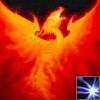
Updated the battle screenshot. The enemies haven't changed, but the hero graphics are slightly updated and I've decided on the style for the backgrounds. Rather than do photos, I made my own. It actually took less time than I spent looking for a picture like this one.
 |
|
| Back to top |
|
|
LeRoy_Leo
Project manager
Class S Minstrel

Joined: 24 Sep 2003
Posts: 2683
Location: The dead-center of your brain!
|
| Posted: Wed Nov 03, 2004 5:51 am Post subject: |
|
|
The trees are interesting... The trunks are toothpick thin, but the style is impeccable. Exelent. Also, Soul Magic and OverPower sound like fun. (What do they do?)
Hm. This thread almost belongs somewhere else. like Game design or maybe even the art area. However, I guess it's been where it is now for a few weeks now, so I am most likely wrong.
_________________
Planning Project Blood Summons, an MMORPG which will incinerate all of the others with it's sheer brilliance...
---msw188 ---
"Seriously James, you keep rolling out the awesome like gingerbread men on a horror-movie assembly line. " |
|
| Back to top |
|
|
St. Ajora
Bloody Angel
Joined: 29 Sep 2004
Posts: 98
|
| Posted: Wed Nov 03, 2004 8:05 am Post subject: |
|
|
Since it is game design, art, and OHR all in one, this is the most appropriate forum, I believe.
"Soul Magic" is Wade's innate ability to channel enemies' soul gems through his sword to use for attacks. It's kind of like Blue Magic, except you earn them differently.
"Overpower" is an ability set that every character has, though the abilities are unique to each character. See the main page of the website for information on how Overpowers work. |
|
| Back to top |
|
|
Moogle1
Scourge of the Seas
Halloween 2006 Creativity Winner


Joined: 15 Jul 2004
Posts: 3377
Location: Seattle, WA
|
| Posted: Wed Nov 03, 2004 6:56 pm Post subject: |
|
|
Intriguing. Not only are the graphics excellent, but the description of the battle system on the website shows you've put some real thought into the gameplay. "Power levels" are FF1-style MP, I'm guessing?
Anyway, I'm keeping my eye on this one.
_________________
|
|
| Back to top |
|
|
St. Ajora
Bloody Angel
Joined: 29 Sep 2004
Posts: 98
|
| Posted: Mon Nov 08, 2004 8:09 am Post subject: |
|
|
Yes, that's my fancy way of saying "Level MP."
I'll have a lot more to showcase soon. Once I stop being so busy, I have about fifteen enemies to scan and color plus character concept sketches to CG for all the main heroes. |
|
| Back to top |
|
|
St. Ajora
Bloody Angel
Joined: 29 Sep 2004
Posts: 98
|
| Posted: Thu Nov 11, 2004 5:51 pm Post subject: |
|
|
Okay, time to revive this thread.

I'm quite satisfied with this look. Yes, it's another one from the intro; that's all I've had a chance to update with the custom textboxes. You can notice that the background animates now if you compare it to the other images. See the first post in this thread for all three in a row.
I could see these catching on. They add a new depth to the dialogue, even if you can't fit nearly as much text into one box. That could be troublesome for some people, though *coughshadowcough*. |
|
| Back to top |
|
|
LeRoy_Leo
Project manager
Class S Minstrel
Joined: 24 Sep 2003
Posts: 2683
Location: The dead-center of your brain!
|
| Posted: Thu Nov 11, 2004 7:31 pm Post subject: |
|
|
Wow. That DID turn out great! Sweet. That's all I can really say. Allthough I still hate the contrast in color of the platform and the lava...Still... Wow.
_________________
Planning Project Blood Summons, an MMORPG which will incinerate all of the others with it's sheer brilliance...
---msw188 ---
"Seriously James, you keep rolling out the awesome like gingerbread men on a horror-movie assembly line. " |
|
| Back to top |
|
|
RedMaverickZero
Three pointed, red disaster!
Halloween 2006 Creativity Winner

Joined: 12 Jul 2003
Posts: 1459
|
| Posted: Thu Nov 11, 2004 7:54 pm Post subject: |
|
|
Awesome, I haven't seen too many games make good use of the whole face script with text boxes. It really makes your games look a bit better.
_________________
---------------Projects----
Mr.Triangle's Maze: 70%
Takoyaki Surprise: 70% |
|
| Back to top |
|
|
Ssalamanderr
Simply too strong. Simply too beautiful!

Joined: 14 Feb 2003
Posts: 208
Location: Out somewhere, Chillaxing.
|
| Posted: Mon Dec 06, 2004 6:33 pm Post subject: |
|
|
So far it looks pretty good. The textbox and character portrait looks good too. I just really don't like how there are only two tiles in those screenshots (lava and bridge, unless I'm missing something). Variety is the spice of life.
The battle looks really good though, so that's pretty much my only critisism.
_________________
Ssalamanderr's Journal!: http://www.livejournal.com/users/ssalamanderr/
Ukelele no good! |
|
| Back to top |
|
|
Jjkaybomb
Brunettes have more hair

Joined: 04 Sep 2003
Posts: 267
Location: Hunting with the mouse
|
| Posted: Tue Dec 07, 2004 6:10 am Post subject: |
|
|
Tch, a stated statment on an old thread.
_________________
A man once said to the Universe "Sir! I exist!"
"However," replied the Universe, "This does not create in me a sense of obigation."
~Stephen Crane |
|
| Back to top |
|
|
St. Ajora
Bloody Angel
Joined: 29 Sep 2004
Posts: 98
|
| Posted: Tue Dec 07, 2004 7:50 am Post subject: |
|
|
You don't need to police threads, Jjkaybomb.
Ssalamanderr, while you have a point, I can't help but think that there's one tile that didn't catch your eye: the border tile between the glassy foreground and the lava-looking background, just below all of the foreground tiles. It's mostly covered up by the textbox, though.
For all who are wondering, no, I am not dead, merely way too busy. |
|
| Back to top |
|
|
|

