 |
Castle Paradox
|
| View previous topic :: View next topic |
| Author |
Message |
Eggie
Joined: 12 May 2003
Posts: 904
|
 Posted: Sun Oct 02, 2005 12:46 pm Post subject: Posted: Sun Oct 02, 2005 12:46 pm Post subject: |
 |
|
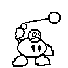
I sliding into a psychedelic flavour right now:
http://www.deviantart.com/deviation/23380066/
The chin looks demented.
Sorry, I have been watching a lot of the Yellow Submarine.
Sincerely, Ryan |
|
| Back to top |
|
 |
SilentAngel
The Angel of Silence

Joined: 16 Dec 2003
Posts: 122
Location: The comfiest chair in #CastleParadox
|
| Posted: Sun Oct 02, 2005 3:55 pm Post subject: |
|
|
OH NOES IT'S THE POMPOUS HIPPIE-LIKE ARTWORK!
...er....yeah.
Anyway, you're getting better with your anatomy drawing, however I'd like to offer a few suggestions/comments:
1) I don't know if this is the style you're aiming for...but the limb extremities (namely the wrists and ankles) are extremely thin. It doesn't look like she could stand up properly.
2) The muscles in her legs don't look that defined....especially her right thigh, it looks too thin.
3) Her right arm looks a bit funny. I can't point out exactly what's wrong, but I think it's that line bordering the underside of her arm - it's dead straight. Consider trying to make it curve like the other arm you drew.
4) Her breasts take up too much of her torso (almost half of it, to be exact). Try making them in a smaller proportion in comparision to the torso next time.
5) Her chin is bugging me, but you already pointed that out. It's too big and bulges out too far. If it was made smaller, it'd probably make the face look a bit better.
Despite these problems, you got the anatomical proportions right, including the length of her arms. Keep up with the improving work! 
_________________
Current Projects:
Hikari no Senshi - Inperiaru Taisen: ~10% Complete
http://www.castleparadox.com/forum/download.php?game=392
Stepmania Online Stats:

Next song to pass on Stepmania: Paranoia Survivor Max (Heavy)
Next song to pass on DDR: MaxX Unlimited(Standard)
|
|
| Back to top |
|
|
Eggie
Joined: 12 May 2003
Posts: 904
|
| Posted: Fri Oct 14, 2005 3:42 pm Post subject: |
|
|
ARE YOU READY FOR FULL-OUT HOT LESBIAN PORNOGRAPHY? Well... I don't have any.
'Till I draw some, look at this. This was me trying to give another shot at anatomy, and added a little more fur to my subjects. I know the feet are weird. I need to work on those.
http://www.deviantart.com/deviation/23933615/ |
|
| Back to top |
|
|
SilentAngel
The Angel of Silence
Joined: 16 Dec 2003
Posts: 122
Location: The comfiest chair in #CastleParadox
|
| Posted: Fri Oct 14, 2005 3:57 pm Post subject: |
|
|
Nice to see you're getting away from simple poses and trying to draw something a little more dynamic. I'm not a person who draws furry characters, so my comments are going to be based on stuff not related to how well you drew the furry itself, more the proportions and stuff.
1) Consider defining her chest into two breasts. At the moment it looks like there's only one. You can do this by defining the shading underneath them.
2) Her waist (on her left hand side) curves out too far. It makes her look like she's bending into a funny position.
Other than that, quite good. The feet need improvement, but you already pointed that out. It's mainly the right foot though, you can fix this by putting it on a different angle.
_________________
Current Projects:
Hikari no Senshi - Inperiaru Taisen: ~10% Complete
http://www.castleparadox.com/forum/download.php?game=392
Stepmania Online Stats:
Next song to pass on Stepmania: Paranoia Survivor Max (Heavy)
Next song to pass on DDR: MaxX Unlimited(Standard)
|
|
| Back to top |
|
|
LeRoy_Leo
Project manager
Class S Minstrel
Joined: 24 Sep 2003
Posts: 2683
Location: The dead-center of your brain!
|
| Posted: Fri Oct 14, 2005 9:28 pm Post subject: |
|
|
| SilentAngel wrote: | Nice to see you're getting away from simple poses and trying to draw something a little more dynamic. I'm not a person who draws furry characters, so my comments are going to be based on stuff not related to how well you drew the furry itself, more the proportions and stuff.
1) Consider defining her chest into two breasts. At the moment it looks like there's only one. You can do this by defining the shading underneath them.
2) Her waist (on her left hand side) curves out too far. It makes her look like she's bending into a funny position.
Other than that, quite good. The feet need improvement, but you already pointed that out. It's mainly the right foot though, you can fix this by putting it on a different angle. |
Your right, but that would make his pics too sexy! I don't think my virgin eyes would survive such a sexy onslaught! 
More seriously:
I recommend hatching under the breasts to show where they stretch the shirt. In other words, just a few slanted lines in marching order, single file, right under the boobies- er breasts.
_________________
Planning Project Blood Summons, an MMORPG which will incinerate all of the others with it's sheer brilliance...
---msw188 ---
"Seriously James, you keep rolling out the awesome like gingerbread men on a horror-movie assembly line. " |
|
| Back to top |
|
|
Gizmog1
Don't Lurk In The Bushes!
Joined: 05 Mar 2003
Posts: 2257
Location: Lurking In The Bushes!
|
| Posted: Sat Oct 15, 2005 7:04 pm Post subject: |
|
|
| It's alright, except her unaboob is way too big. Make 'em a little smaller, and try not to go so wild with the leg positions, maybe practice with someone just standing up straight on, and from a profile, and then gradually figure the steps in between, and how different leg positions look. (I don't know if the unaboob way intentional or not. I mean, I've seen some furries who are into such things, particularly bovinites, who love cows, and big milkin' udders) |
|
| Back to top |
|
|
Gizmog1
Don't Lurk In The Bushes!
Joined: 05 Mar 2003
Posts: 2257
Location: Lurking In The Bushes!
|
| Posted: Mon Oct 17, 2005 9:53 pm Post subject: |
|
|
| Sorry for the doublepost, but Eggs, next time you see me, remind me to ask you to do some graphics for Halloween No Ingles 2. I don't have time for drawings, and I think your stuff is good enough for a No Ingles game. I'll give you details on it next time we talk, in private. |
|
| Back to top |
|
|
Eggie
Joined: 12 May 2003
Posts: 904
|
| Posted: Wed Oct 19, 2005 2:41 pm Post subject: |
|
|
| Gizmog1 wrote: | | I think your stuff is good enough for a No Ingles game. |
Um... that's... um... almost an honour (honor).
Yeah. I might be up to it.
Is he serious?
I'm good at tiles, in my opinion. |
|
| Back to top |
|
|
Gizmog1
Don't Lurk In The Bushes!
Joined: 05 Mar 2003
Posts: 2257
Location: Lurking In The Bushes!
|
| Posted: Wed Oct 19, 2005 4:15 pm Post subject: |
|
|
| I was thinking more of cutscenes, maybe. I can make time for walkabouts and tiles, but cutscenes are just a whole different kettle of fish. It's way too late to impose on you though, so I'll probably just come up with something. |
|
| Back to top |
|
|
Eggie
Joined: 12 May 2003
Posts: 904
|
| Posted: Wed Nov 16, 2005 7:28 pm Post subject: |
|
|
I actually sprite! Veeeeeerrrrrrryyyyy slooooooowlyyyyyyyyyy. This is just a guy I made. Hero sprite. Violet sword. I must confess I used a Megaman sprite as a start-upper. Is that such a crime?
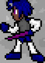
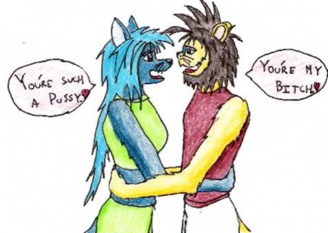
This picture is me trying out broughts, and me trying to be funny:
I fail with flying fur.
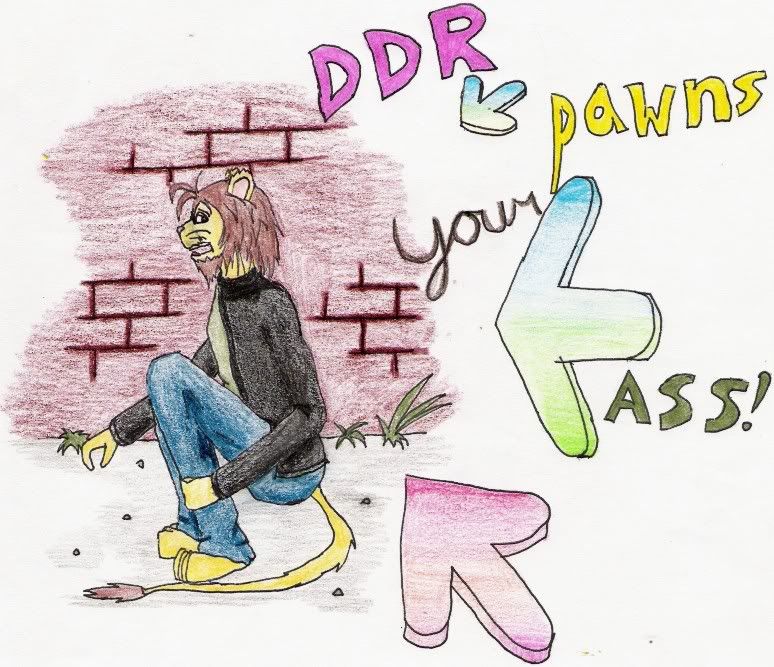
Now, I play DDR sometimes, and it pawns my ass to Mars. So I drew this trying out backgrounds:
So, three pictures from Ryan. |
|
| Back to top |
|
|
Sparoku
Pyrithea Amethyst.

Joined: 02 Feb 2004
Posts: 467
Location: Washington State
|
| Posted: Wed Nov 16, 2005 7:39 pm Post subject: |
|
|
#1: The sprite isn't too bad at all, but it does look a bit funny because of the image's current size.
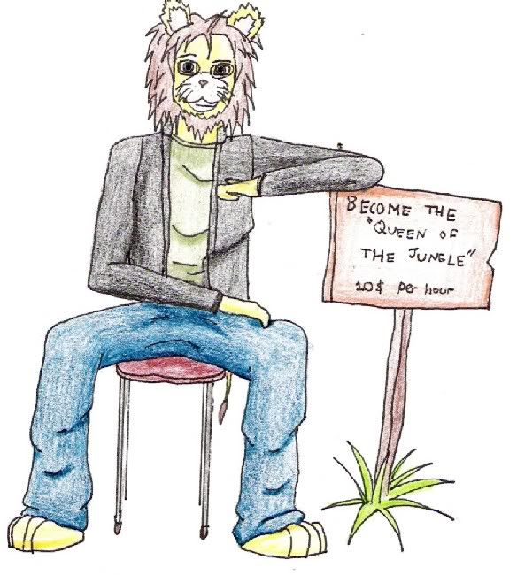
#2: I like the pencil shading in this pic a lot. The lion's front paws need a bit more detail though, they look kinda flat.
#3: You did very good side profiling with the lion in this one and the background is well done. As I said before though, the front paws need work.
I like these works Eggie and I hope to see more stuff from you soon.
_________________
"There will always be people who will tell you they hate what you made, or like what you made, and will tell you that what you did was wrong or right."
My Discord ID: SparDanger#0305 |
|
| Back to top |
|
|
Eggie
Joined: 12 May 2003
Posts: 904
|
| Posted: Fri Nov 18, 2005 5:55 pm Post subject: |
|
|
| Sparrowhawk wrote: | | #2: I like the pencil shading in this pic a lot. The lion's front paws need a bit more detail though, they look kinda flat. |
You mean hands? Okay. I'll try. |
|
| Back to top |
|
|
Sparoku
Pyrithea Amethyst.
Joined: 02 Feb 2004
Posts: 467
Location: Washington State
|
| Posted: Sat Nov 19, 2005 4:23 am Post subject: |
|
|
Yeah, I said "paws" because he's a lion, but I meant hands.
_________________
"There will always be people who will tell you they hate what you made, or like what you made, and will tell you that what you did was wrong or right."
My Discord ID: SparDanger#0305 |
|
| Back to top |
|
|
Eggie
Joined: 12 May 2003
Posts: 904
|
| Posted: Mon Dec 05, 2005 7:27 pm Post subject: |
|
|
Two more tries with anatomy.
I put on tighter clothes to help visualize anatomy. Never mind the speech bubbles. They don't matter.
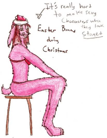
The head sucks, I know. Never mind that, and focus on the other flaws that I don't see. What's wrong with her body? I put her in less clothes to help visualize anatomy. |
|
| Back to top |
|
|
Obright
Vestigial Organist
Joined: 16 Nov 2005
Posts: 70
Location: By the wayside
|
| Posted: Wed Dec 14, 2005 1:30 pm Post subject: |
|
|
The body proportions look fine to me. The legs are a bit long and sproingy, but that makes sense on a rabbit, right? The shading on the shoulder could be smoothed out a little, it looks a bit like she's wearing a fursuit (it's those damn wrinkles in the fabric, again!)  What medium do you generally work in? Depending on what it is, I can suggest some art material considerations for you. Is there an art supply store near where you live? One more thing on the body, the overall feel of her posture is one of being posed...kinda stiff. The problem, I think, is that you need to be drawing from life. Is there anyone who can pose for you? Imagine a pose for your character, and then get your model to pose that way, so that you can acheive a more natural feel. It's important that your model provides you with a natural feel also, so make sure they don't have that 'OMG I'm on camera!' look about them, or you'll just wind up duplicating it. What medium do you generally work in? Depending on what it is, I can suggest some art material considerations for you. Is there an art supply store near where you live? One more thing on the body, the overall feel of her posture is one of being posed...kinda stiff. The problem, I think, is that you need to be drawing from life. Is there anyone who can pose for you? Imagine a pose for your character, and then get your model to pose that way, so that you can acheive a more natural feel. It's important that your model provides you with a natural feel also, so make sure they don't have that 'OMG I'm on camera!' look about them, or you'll just wind up duplicating it.
| Eggie wrote: |
The head sucks, I know. Never mind that, and focus on the other flaws that I don't see. |
Now hold on there...what is it that you don't like about the head, exactly?
As far as I can tell, the whiskers might be a little bit thick, the inside of the mouth might do with a bit of detailing, and the breastbone might be sticking up a little too high, giving the effect that the head's just stuck on as an afterthought (and I know that sounds like a lot of stuff), but as a whole, I think it looks natural. All of the things that I said, and indeed much that others have said about your artwork, is purely subjective. Some people are always going to find fault with what you're doing, but the point is that YOU like what you're doing. Correct me if I'm wrong, but I think what you're trying to do is make your characters more realistic, more lifelike, right? If that's the case, then you're showing vast improvement compared to the beginning of this thread. I can probably help a little bit.
-People prattle on and on about the 'folds in the fabric' issue, but pay them no heed...the important thing is that you're paying attention to a detail, and that attitude will carry over to other details in your work. Tiny details can totally make a difference.
-I can't legally tell you (who may be a minor) to go out and buy a playboy,
but even a SI swimsuit issue will have plenty of anatomical models for female figure studies. I can already tell that you've gotten much better. If you plan on studying art in college, and take a figure drawing class, you'll probably have nude models anyway. The sketch you did of the back of the guys head would have withstood the critique board of any college-level figure drawing class I've ever taken.
-It's important to always keep working!! The more you do it, the better you get. Don't let people slinging mud at you kill your spirit. It takes balls to post your artwork online, especially when you're inviting a critique...
and although people at DA might be infamous for blowing smoke up one's ass, the opposite is true in this thread. Encouragement without direction is not productive, but criticism without direction is destructive. Respect the man, or start your own thread, like his, so I can tear YOUR artwork to peices.
....ahem...but I digress...sorry...mars in libra. 
EDIT- I don't mean to imply that everyone's been disrepectful in this thread, but there were some comments made that I think were totally unneccessary.
_________________
'I imagine that imagination is more important than knowledge, but I don't know.' |
|
| Back to top |
|
|
|
|
You cannot post new topics in this forum
You cannot reply to topics in this forum
You cannot edit your posts in this forum
You cannot delete your posts in this forum
You cannot vote in polls in this forum
|
Powered by phpBB © 2001, 2005 phpBB Group
|

