 |
Castle Paradox
|
| View previous topic :: View next topic |
| Author |
Message |
Komera

Joined: 07 Feb 2003
Posts: 711
|
 Posted: Sun Feb 09, 2003 6:12 am Post subject: Not fair for me to cretique without getting it in return Posted: Sun Feb 09, 2003 6:12 am Post subject: Not fair for me to cretique without getting it in return |
 |
|
(You know, that error I'm getting every other time I click ANYTHING here is starting to get annoying... and if I happen to forget about it? Gotta retype everything, that's what happens.)
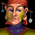
Normally I don't post my own pictures, but Royal seems interested in cretiquing mine, so I'll give. But as I don't plan to post pictures often, I'm just going to show you a sizeable number in one post. The reason I don't post pictures often is because I don't get what I'm after... namely... cretiques. (Which is why I now dub myself this forum's unofficial official cretiquer... does that even make sense?) I figured that's what Royal was really after, and thus why I gave him one so long that it got cut off at "quanti-"
Now, these are pictures I'm particularly proud of for various reasons. Some you may have seen before, some are probably new to you. Most of these I've declined to ask for opinions on before (because I knew I wasn't going to get the cretique I wanted)... but here they are now.
Yes, it is GeoCities. I don't bother myself to find a host that allows remote linking because it would slow down loading time if I included my huge-o pictures inside the posts. So just copy and paste urls or click and hit reload, or whatever your prefered method of looking is.
EDIT: Flock you, url tags!
EDIT EDIT: Flock the urls, just go here- http://www.geocities.com/klharrismith/pictures.html
Note to would-be cretiquers: You might want to limit yourself to one image cretique per post, or better yet... just one image... period.
_________________
LJ.Art
SD - Ten creatures remaining. |
|
| Back to top |
|
 |
Rolling Stone
Bastard Gunslinger

Joined: 21 Jan 2003
Posts: 494
|
| Posted: Sun Feb 09, 2003 1:49 pm Post subject: |
|
|
Since I don't have time right now to get into each particular piece, I'll give a general style critique. My two suggestions are to widen your influences, and to study theatre.
Your use of color and light is great, and you're lookin' for critique, so I won't bring them up again.
For style, in one of these there appears to be some influence from Giger, and everything else seems to be a bit too eastern feeling. Not that that's a bad thing, but it's just that it's obvious what era it's from and what influenced you. When you take strong influence from the entire history (Or as much of it as you can find) of art you develop a more unique style that, like all great art, becomes timeless. Malacat reminded me a bit of Peter Paul Reubens, follow that more is what I'd reccomend.
For theatre, that last pic of... someone, I didn't feel he was truly injured, so much as a weak person. It's only the smallest difference, and it may be entirely in my interpetation, but I think that drawing accurate character poses and expressions, writing accurate characterizations, and acting, all require the same skill(s), which is understanding exactly how someone else feels without being in their shoes, and knowing how it appears based on who they are. The way (Person)'s knees comes together suggests not so much that he (or she) is injured, as that he had no place in battle in the first place. Subtle tricks can make characters seem stronger or weaker through the smallest things. In old westerns they used to make the doors that the heroes would walk through just a little too small, thus making them look larger than life, they would also have the damsels in distress walk through bigger doors to seem more fragile. Also, Mavijo looks like a water dragon who seems to be afraid of water.
And the first thing that came to my mind from these drawings was that you have what it takes to be an artist, and that's an imagination.
_________________
BANDIT REVOLVER, DOWNLOAD IT OR ELSE.
http://www.castleparadox.com/forum/gamelist-display.php?game=620 |
|
| Back to top |
|
|
Komera
Joined: 07 Feb 2003
Posts: 711
|
| Posted: Mon Feb 10, 2003 4:07 am Post subject: |
|
|
| Quote: | My two suggestions are to widen your influences, and to study theatre.
|
poo and great suggestion
| Quote: | | everything else seems to be a bit too eastern feeling |
I do believe you're the second person who's said that about my work, though the first specified my work looked like a cross between Chinese and Thai. My only reasonable explanation of why this may be the case is because the house I grew up in is decorated with a large number of Thai objects because my mother is (you guessed it) Thai.
| Quote: | | For theatre, that last pic of... someone |
Wingedmene, the title character of Wingedmene Part One (see Game List). I got the idea from a copy of a Greek statue, though as the note said, the last picture is not finished, and he is supposed to be leaning against a collumn (which I've obviously have yet to implement). I guess I should have added that to either the note or to the post above.
| Quote: | | Subtle tricks can make characters seem stronger or weaker through the smallest things. |
I should remember that (sheepish).
| Quote: | | Also, Mavijo looks like a water dragon who seems to be afraid of water. |
Drat... I was after Mávijo playing in the ocean. Though now that I think about it, that might be hard to tell as he doesn't have a very mobile face (snout?).
| Quote: | | And the first thing that came to my mind from these drawings was that you have what it takes to be an artist, and that's an imagination. |
I know people who think otherwise. (sigh) Alphaknight tells me I'm too repetitive for an artist. Though sometimes I think Alphaknight expects me to be the next Michelangelo regardless if I have little interest in spending 60+ years of my life painting ceilings. My real goal is children's book illustrating, though I've yet to get a publishing company to take me seriously. (sigh) I'm so terrible at taking compliments, aren't I?
_________________
LJ.Art
SD - Ten creatures remaining. |
|
| Back to top |
|
|
Rinku
Joined: 02 Feb 2003
Posts: 690
|
| Posted: Mon Feb 10, 2003 9:05 am Post subject: |
|
|
i'd take repetetiveness as a virtue, a branch of perfectionism, and not antagonistic to imagination. you can only get good at something by doing it over and over. i'd even go so far as to say that repetetiveness is imagination -- by doing something over and over, each time a new way, new things are created by varying the original.
think of rpgs, for example. there are millions (probably literally) of rpgs, each one is at core the same thing, but by repeating it over and over new ways are found to perfect it, so you get things like persona and xenogears and earthbound and suikoden and so on, each of which is basically a repeat from dragon warrior, but each of which is imaginative. |
|
| Back to top |
|
|
Rolling Stone
Bastard Gunslinger
Joined: 21 Jan 2003
Posts: 494
|
| Posted: Mon Feb 10, 2003 9:31 am Post subject: |
|
|
..But for a character designer, I would say quite the opposite of being repetitive. As a character designer, you have to design a universe of people (A small universe, but a universe), and to tell these people apart clearly, they'd better not all wear the same thing to the prom (See Dragon Ball Z). Stylistic elements and technique and such need to be repeated to perfection (Or to satisfaction, Amano Yoshitaka is a wonderful artist but miles from perfect), but when it comes to imagination, the only way to excersize it is to challenge it to come up with something new every single time you communicate with it. Otherwise your imagination grows stagnant while you perfect an idea you came up with when you were 10. And I hope that your entire life of work doesn't produce a single perfect image of Wingedmene and nothing else.
I knew that was Mene BTW, but it said spoiler so I was tiptoeing around naming names.
As for childrens book illustrations, I think that you have what it takes in terms of talent, but perhaps it's not what they want in terms of technique. The best children's illustrations are usually very soft and relatively simplistic in design. For an example I would say to look at Maruice Sendak (Where the Wild Things Are) as a children's book illustrator, vs. Brian Froud (The Labyrinth) as a fantasy illustrator. They could both take the same idea, but Sendak would make it look more, I don't know, innocent I suppose, just friendlier. Of course, I haven't seen your children's book type illustrations, so I'm really just talking out of turn here.
_________________
BANDIT REVOLVER, DOWNLOAD IT OR ELSE.
http://www.castleparadox.com/forum/gamelist-display.php?game=620 |
|
| Back to top |
|
|
Komera
Joined: 07 Feb 2003
Posts: 711
|
| Posted: Mon Feb 10, 2003 9:56 am Post subject: |
|
|
Concidering the two with the spoiler notes are called mene.jpg and battlewinger.jpg... I hardly would think that simply saying the name would give away secrets.
Though frankly... I try not to look at Dragonball Z if I can help it.
_________________
LJ.Art
SD - Ten creatures remaining. |
|
| Back to top |
|
|
zetes
Joined: 03 Feb 2003
Posts: 71
|
|
| Back to top |
|
|
Royal

Joined: 05 Feb 2003
Posts: 61
Location: Stockholm Swe
|
| Posted: Wed Feb 12, 2003 12:57 am Post subject: |
|
|
Heh that's alot of pictures nice work. You got a very unique style!
My favorites are number one and number 7.
The first one because it's simple and well excecuted and the last one for the good use of lighting.
As a general critique I'd like to see you spend more time on your backgrounds, the style differs alot from what you do to render your characters. Sharp black outlines, light airbrush shading contra kinda blurred more realistic stuff in the BG, not a big fan of this but it's just my opinion.
Another thing I think you should consider trying out is to use more nuances of color, right now for example (the?) malacats fur is one solid color, try out a wider range of brown before shading to give more life to it.
The last tip I wanna give you is to favor alot more from darker shadows and more highligts, right know you can easily spot your lightsources (good job on that) but since there is only one darker shading color and not that many bright spots, the images tends to be abit flat. If that's what youre going for it's all good but Id personally would like to see more depht.
Keep up the good work! |
|
| Back to top |
|
|
Komera
Joined: 07 Feb 2003
Posts: 711
|
| Posted: Wed Feb 12, 2003 2:52 am Post subject: |
|
|
I know people who didn't like #1 BECAUSE it was so simple. Alphaknight doesn't like it because of the "Jar Jar Jedi" in the back (I hadn't intended it to look like either...)
I agree with you on a large number of points. The backgrounds are never as sharp as I really want them, and the best I usually manage without mutilating it into 16bit is to stick a cloud in front of it and hope people think it's the clouds that make it blurry. The next set of pictures will probably wind up with the bgs filtered with brush strokes (because frankly this has always been a bothersome problem).
And I've been debating off and on about the malacat's fur. It's currently one color because I was thinking of the local cougars (puma, mountain lion, whatever you want to call it...). Not exactly the most visually appealing of choices... was it? *^_^* Though at the time it made sense, cougars being the head honcho cat here.
The reason #7 has the dramatic lighting that it does is because I devoted four layers to shading (two for black and white, two for chromatic) while the other pictures only have two layers for shading (black and white only, I was not confident I could chromatically shade without destroying detail). This isn't an excuse for the other pictures, of course. You are right, they aren't eye catching enough, and eye catching is exactly what they need to do when I send pictures off to publishing houses (three of the pictures are in the que for my next batch of ph pictures).
I'll see about fixing up the ones I still have the psd's for (previous computer crashes have vanquished some of my psd's).
_________________
LJ.Art
SD - Ten creatures remaining. |
|
| Back to top |
|
|
|
|
You cannot post new topics in this forum
You cannot reply to topics in this forum
You cannot edit your posts in this forum
You cannot delete your posts in this forum
You cannot vote in polls in this forum
|
Powered by phpBB © 2001, 2005 phpBB Group
|

