Pixelation Lesson 2 - Shading & Size
by Sew
Today we are going to work on shading for images that are larger than 20x20 (40x40 in this case), and hopefully learn a little about the shape of objects.
Start by drawing a perfect circle in a 20x20 area. But woah, hold the phone! I thought we were making something that was larger than 20x20? Well, we are. To make sure that the circle fits in each of the 40x40 square tiles evenly, it's importaint to start it as 20x20 (Because 20x20 is an even number, and will leave 10x10 pixels of our circle in each tile(Ew, maths!))
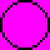
Now that we have our circle drawn, let's turn it into a sphere by means of shading (and lighting). We'll start by choosing the location of a light source, and what colors we want it to be. Our light source will be located to the upper-right of the object, and let's go ahead and go with purple as a color.

This is just our circle witha base color; nothing special yet. Also notice that I've changed the outline from black to a dark purple, since our sphere is purple, I'd like to outline it in that color.

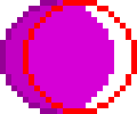
From there I add a lighter color (one shade lighter than my base) in the shape of a crescent. The shading is suppose to curve along with the shape of the circle to give it depth. It's important to remember that a sphere is a three-dimensional object, so you'll have to shade with a curve to make it look like a sphere. If you don't, you could end up with something like this:

That doesn't look like much like a sphere, does it? If you're having problems shading it correctly, one way to try and correct yourself is creating a new circle in your old one. You'll have to move it a little off to the side, like so:
Then you can color everything to the left side of the red line, and to the right side of the dark-purple line. If done correct, you should have a nice, shade-y curve.

The next step is just like the previous one, except I went 2 shades lighter than my last color. The color jump isn't necessary, but it makes the light seem stronger.
Repeat the same process one more time. Let's only go one shade lighter this time. You'll want to make this curve a little smaller than the last two. Also, notice how this color doesn't go all the way to the far edge of the circle. See how it cuts off right before hand? Doing that make it seems like the light isn't just from the right, but a *little* towards us.

Now that we've done the brighter side of the circle, you can add an extra shadow color to the opposite end. Same process as the others, just in a different direction.

Another way of coloring the sphere would be by means of dithering, and I'd almost say you could just dither the image after you've shaded it like we have. But wait, what is dithering you ask? Dithering is a way if shading things. But isn't what we did shading? Well yes, it is. But if you want to take it a step further and make your sphere look more dramatic, dithering might be fore you. Dithering can make obejects look more interesting, and add to the texture of an object.
Dithering is a series of crosshatches similar to this:

There are many different ways to dither, but this is the 'tighest' form of it. Checkboard-ish. Spacing out the crosshatches by a pixel or two can achive different effects; some bad, some good. In the end, the way you dither is up to you.
Dithering isn't really the easiest thing to teach with an essay. You'll (hopefully) find it a lot easier to understand by visual means.

This is there sphere after I dithered it. I noticed it didn't look so hot all blow up, so I shrunk it down to it's original 20x20 size, a 40x40 version, an 80x80 version, and, of course, the 160x160 version.
After you have made your sphere, plot out a 40x40 tile. I've colored coded a circle outline so you can tell which part of the circle will fall into which tile easier.
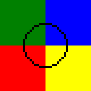
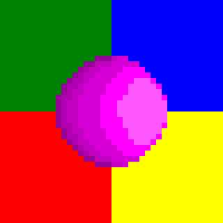
Now, the reasoning behind putting it in 4 tiles instead one is that it make's the sphere appear larger bigger in-game. Now you might not believe me, but think of it this way: There are 4 tiles around a one tile sphere, and 8 tiles around a 4 tile sphere. Meaning it would take the player longer to get around the 4 tile sphere, and thus makes it appear to be larger than it actually is.
Also, an importaint thing to remember is if you make really large maptiles, you need make sure they are divisible by 20, or they'll mess up when you import them into the ohr.